
BRAND IDENTITY REFRESH
Cry Baby’s:
Six Years Later
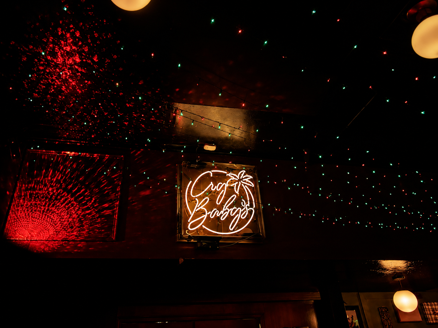
Expanding an established bar identity into a louder, stranger visual system.In 2019, I was asked to create the identity for a new bar in downtown Gainesville. One thing was settled from the start: the logo had to work in neon. That requirement shaped the design. Six years later, the mark had become inseparable from the place, so replacing it was never the goal. The refresh builds outward from that foundation—introducing new wordmarks, illustrations, symbols, and applications while preserving the personality that made the brand recognizable.
SCOPE
Identity expansion, wordmarks, typography, illustration, and brand applications
Deliverables
Logo system, illustration library, menus, merchandise, and signage
SIX YEARS IN, THE LOGO WASN’T THE PROBLEM
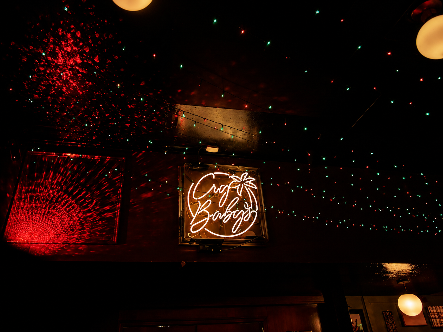
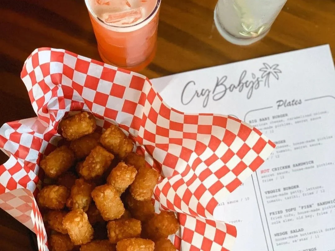
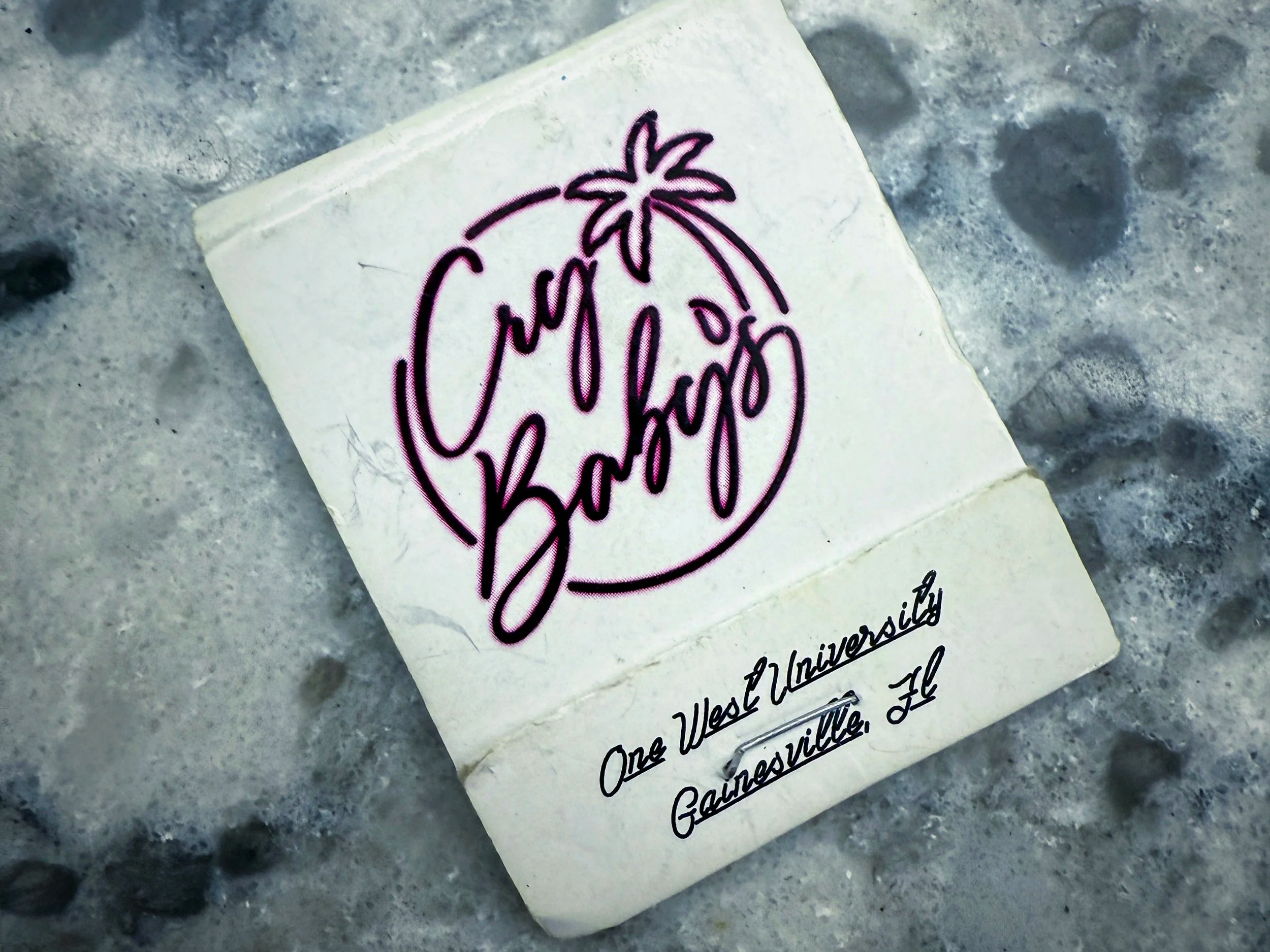
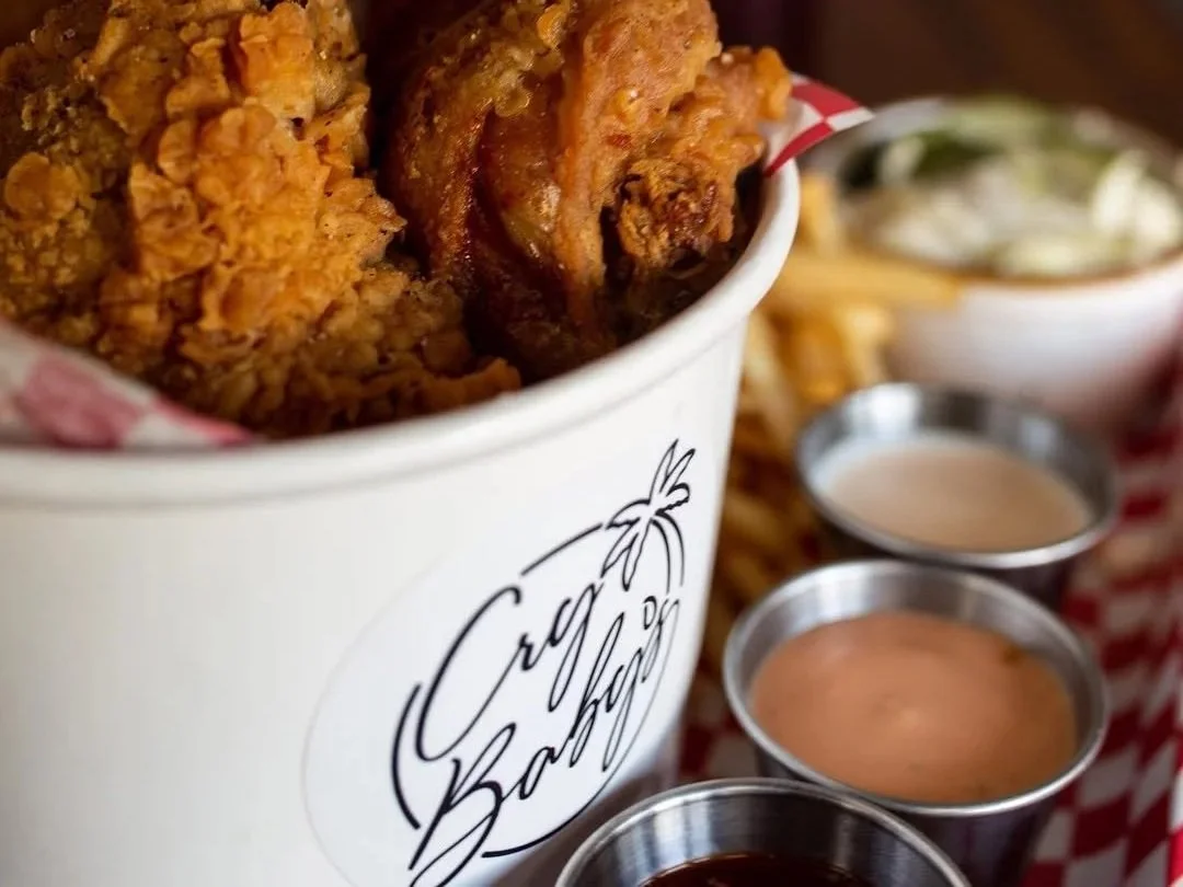
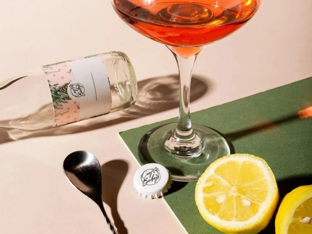
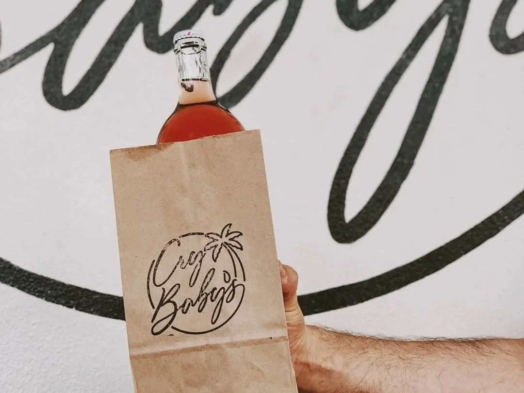
The loose script, looping letters, and palm-tree flourish were drawn around the way neon actually behaves—where the tubing can bend, how much space the forms need, and how the whole thing would look glowing over the bar at night. What began as a sign became the bar’s signature, appearing across menus, bottles, matchbooks, packaging, merchandise, and throughout the space.
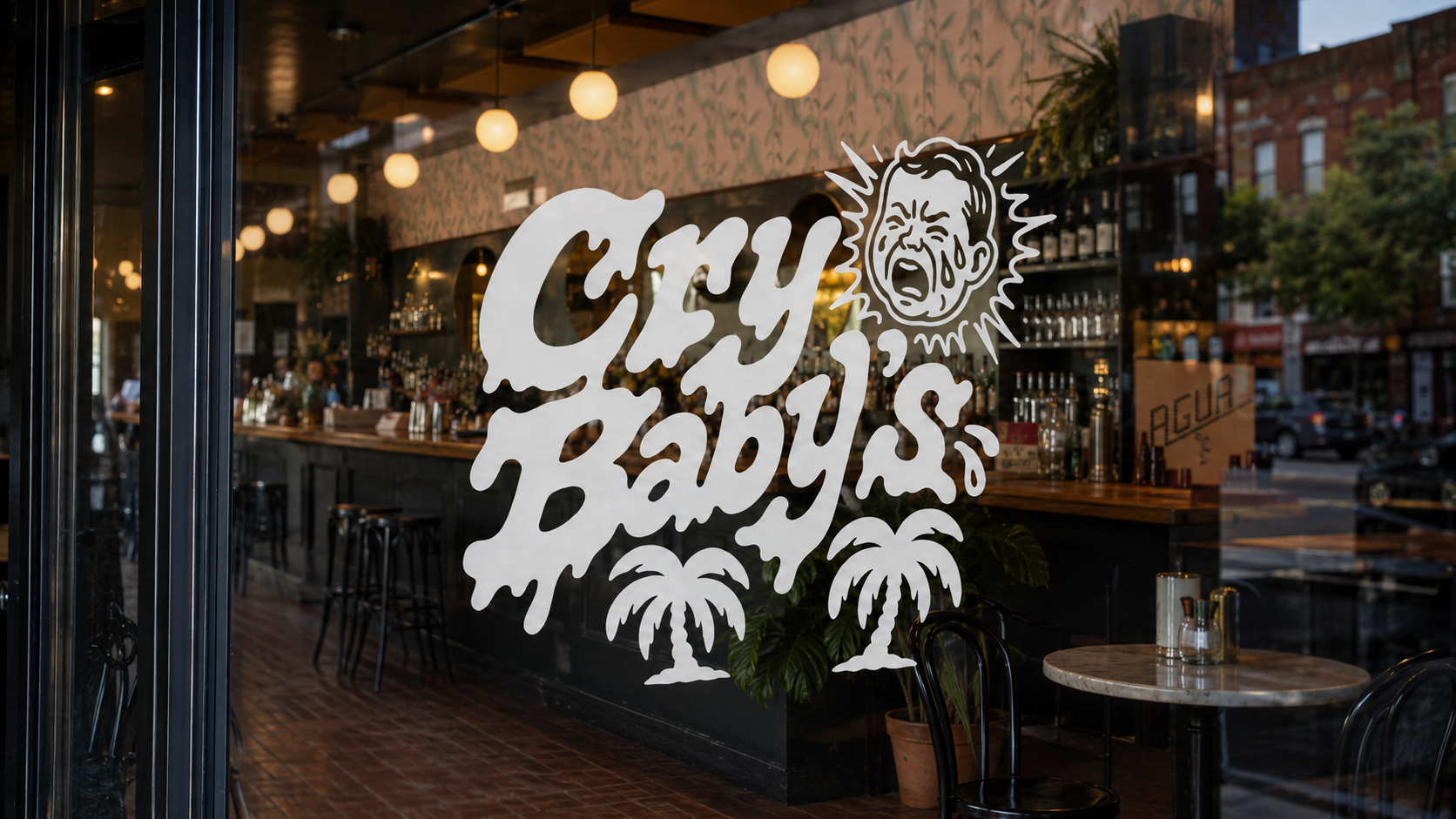
The problem wasn’t that the identity had stopped working. It was that one logo was being asked to do too much. So I kept the neon script and built around it: new wordmarks, illustrated panels, and a loose cast of characters that gave the brand more range without losing what people already recognized.
The result is a visual language that can scream across windows, cry through menus, and lash out on merchandise.
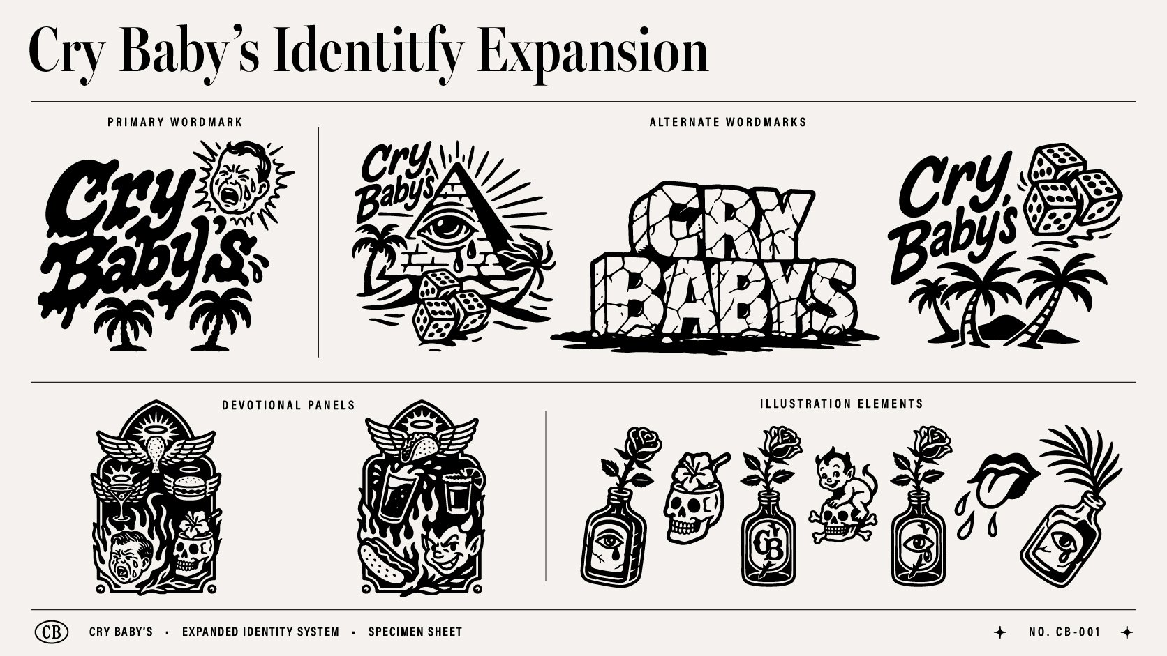
Eat. Drink. Repent.
The new work pulls from tattoo flash, tropical ephemera, and devotional art—references that already felt at home in Cry Baby’s world. Burgers get halos. Cocktails are treated like offerings. Crying faces, devils, dice, palms, flames, and skulls show up again and again, moving from coasters and swizzle sticks to matches, menus, shirts, and windows.
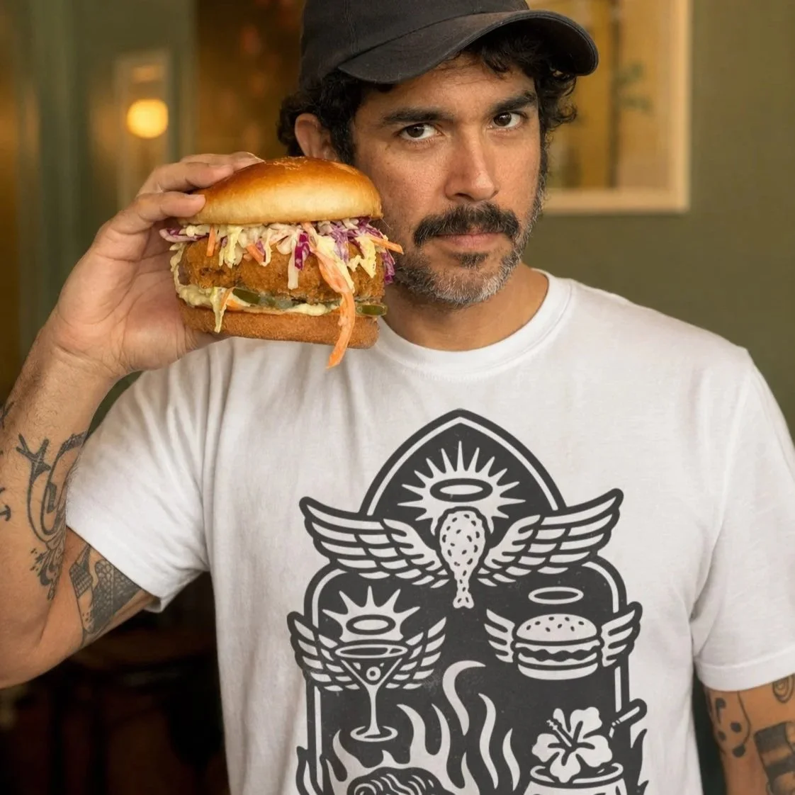
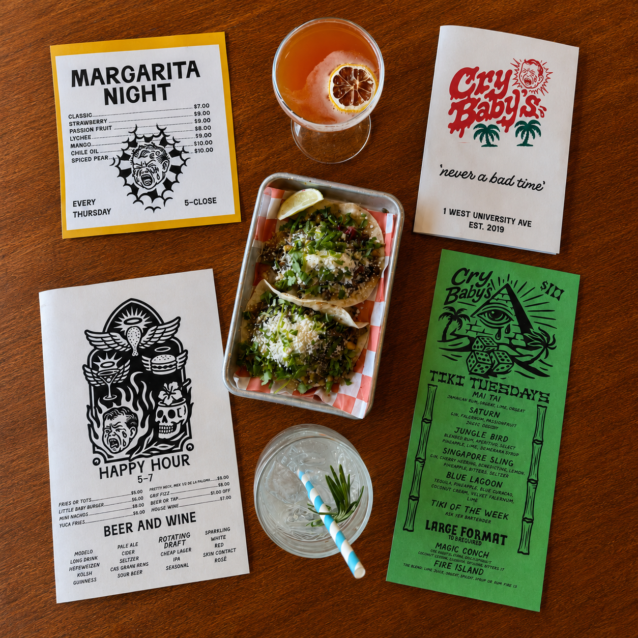
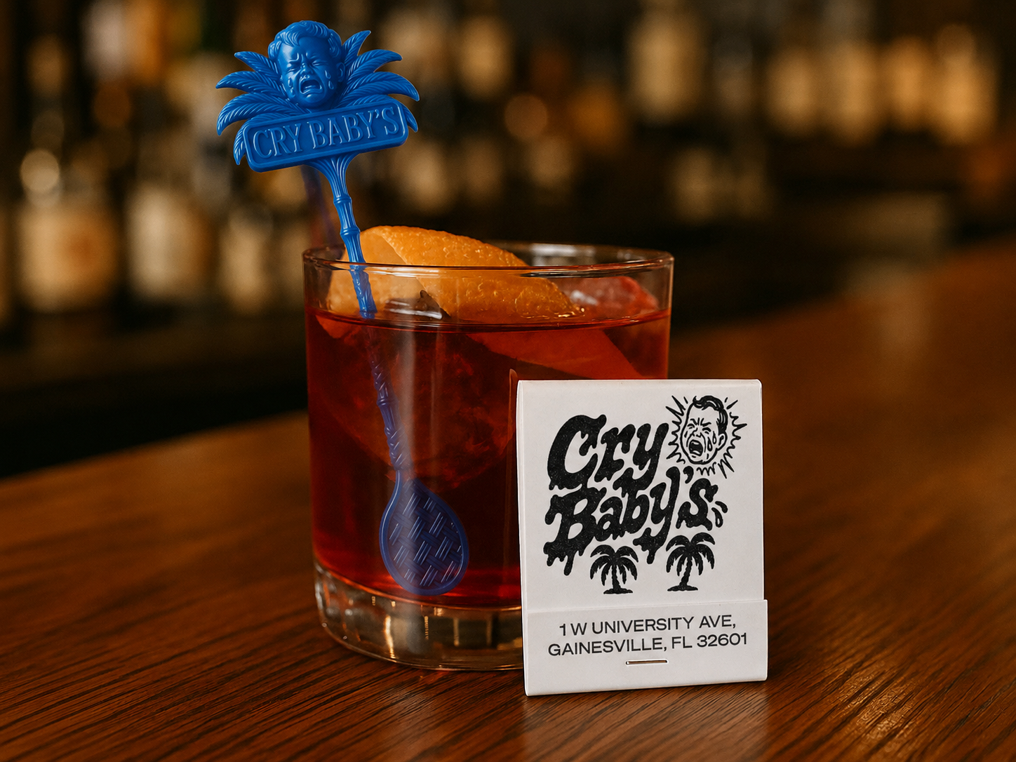
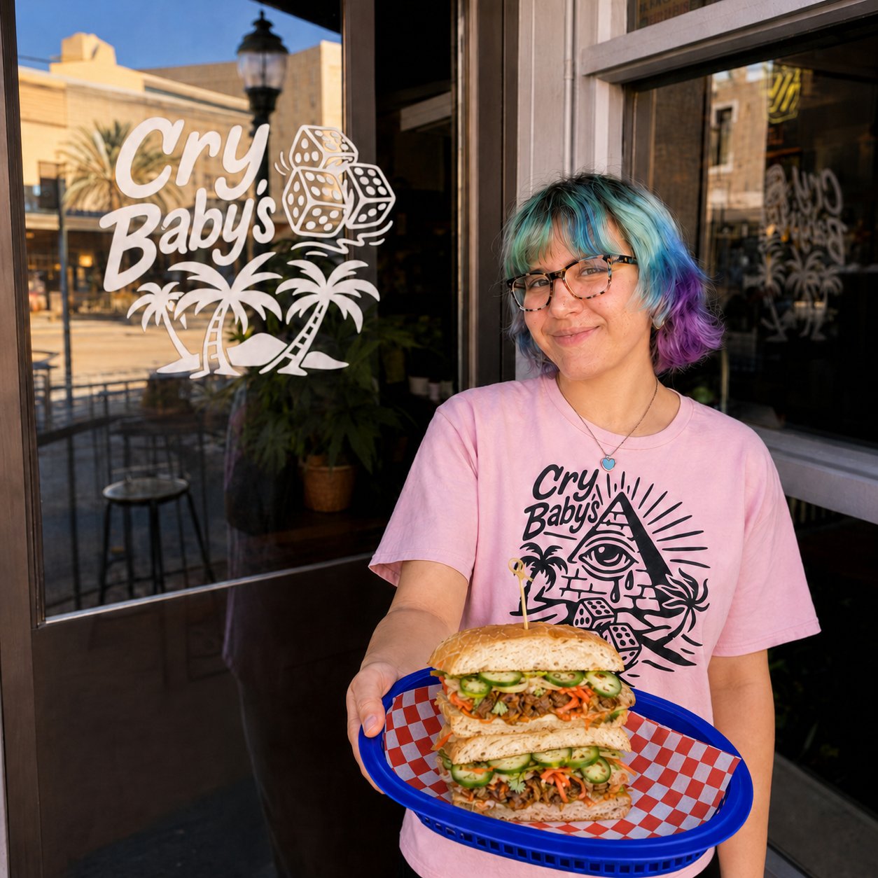
Cry Baby’s didn’t need a rebrand. It needed more ways to make noise. The original neon script still holds everything together. The rest pushes the identity further into tears, temptation, cheap thrills, and tropical trouble.