

Brand Identity
Pop-a-Top
Not your average corner store.Created by the owners of The Top, Pop-a-Top brings the familiarity of an old-school general store into a distinctly local, modern setting. Its two locations have very different personalities: one sits at the busy corner of University Avenue and Main Street, while the other occupies Gainesville’s historic train station at Depot Park. The identity needed to seamlessly connect the two spaces.
SCOPE
Art direction, brand identity, logo design, typography, illustration, signage, packaging, and merchandise
DELIVERABLES
Primary and secondary marks, hand-painted signage, and packaging
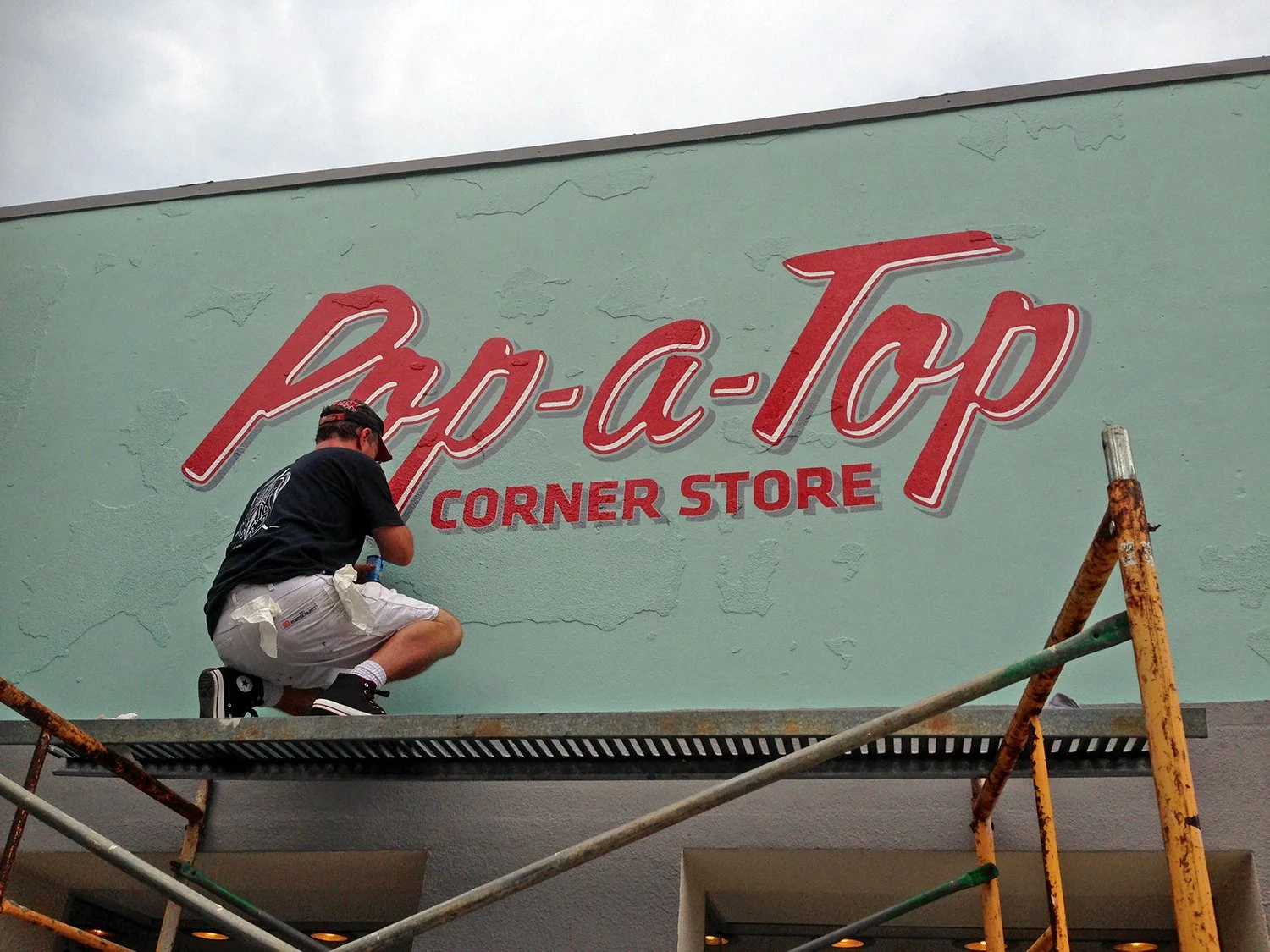
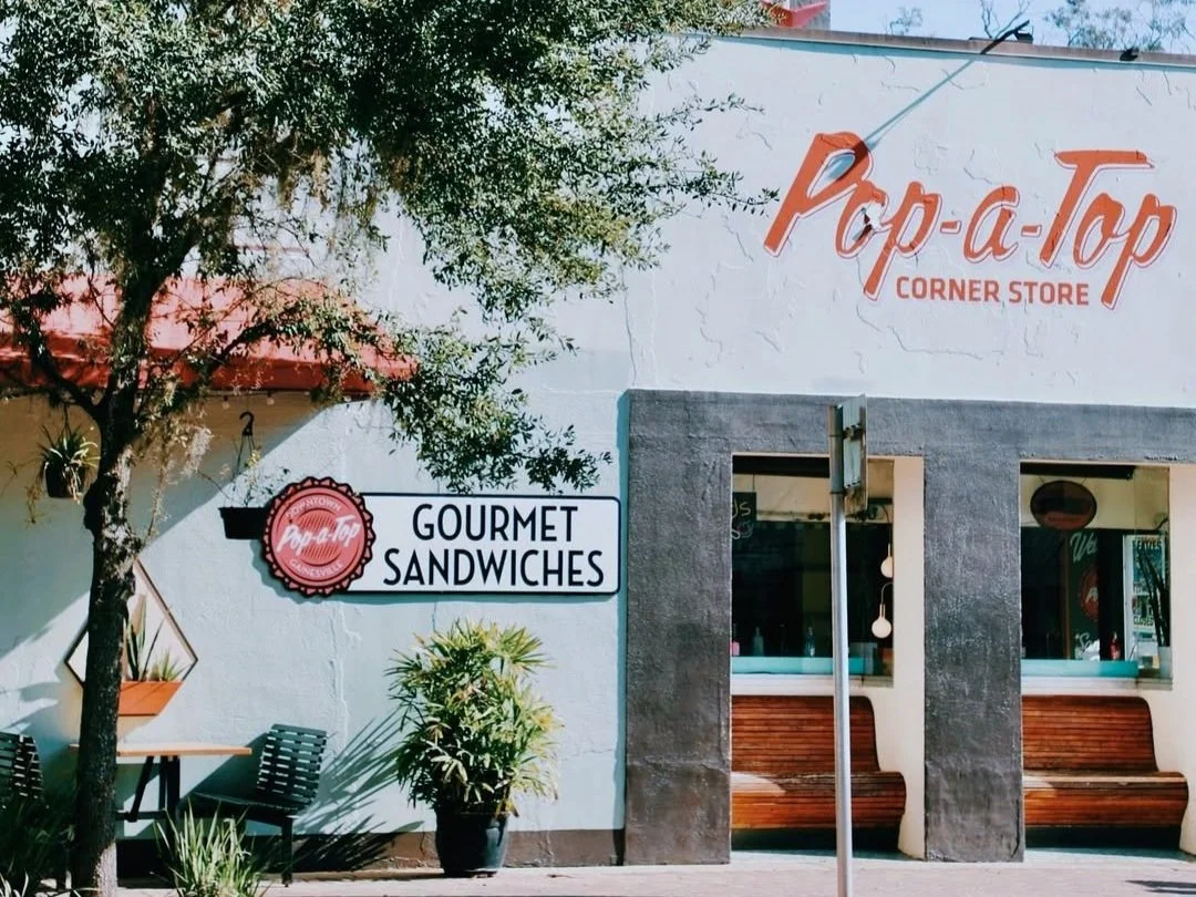
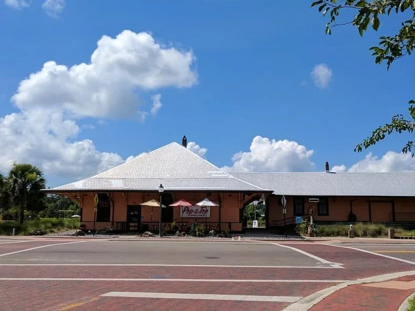
The identity needed to feel cohesive while giving each location its own expression. One mark was designed for a hand-painted sign, while the other was built for a dimensional lightbox, with both extending across packaging and merchandise.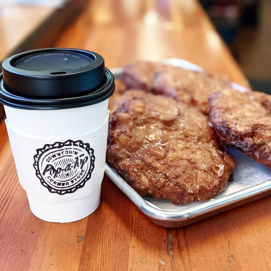
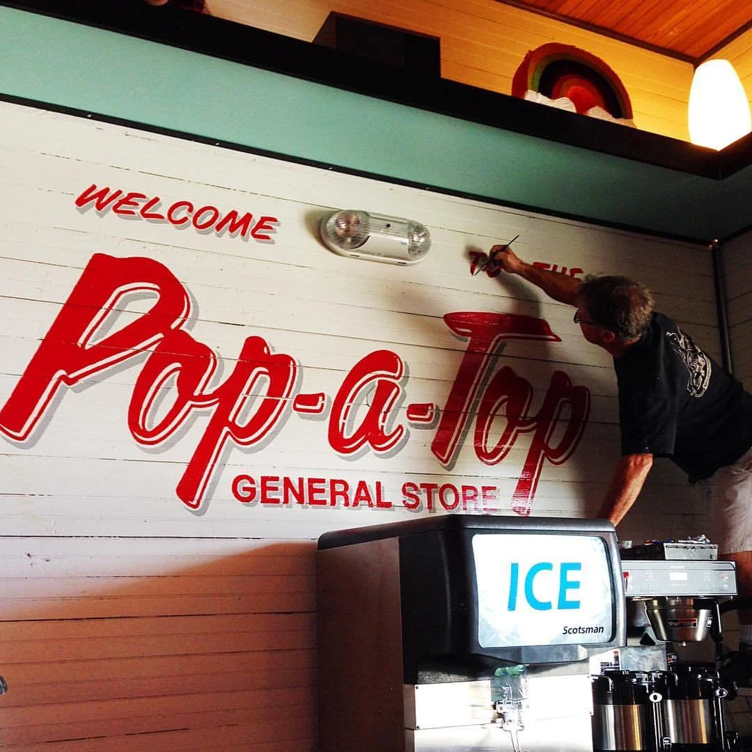
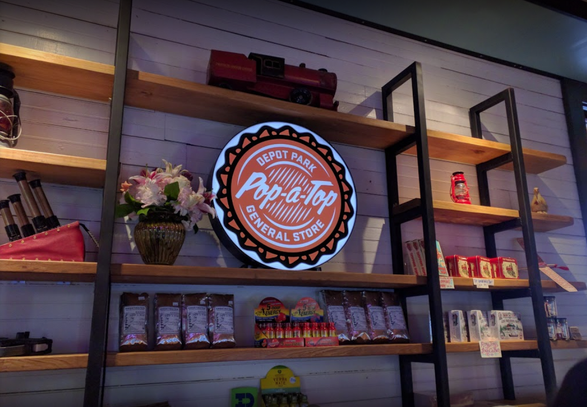
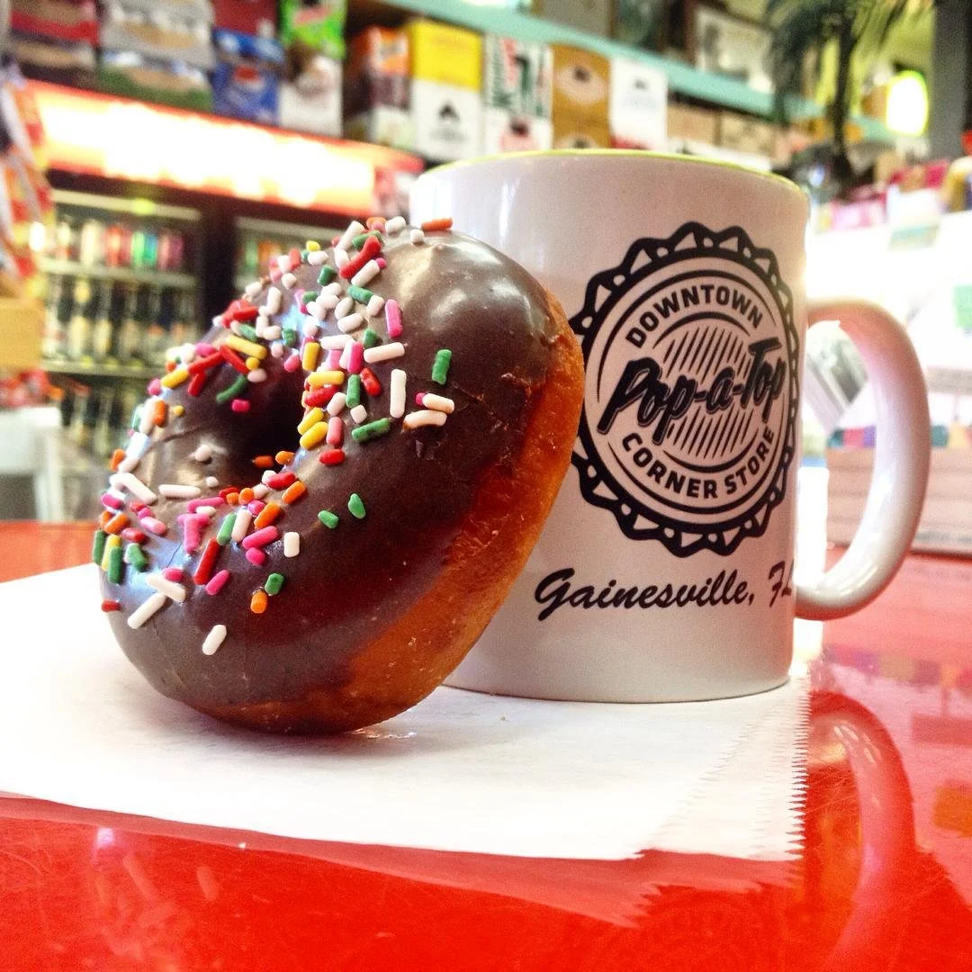
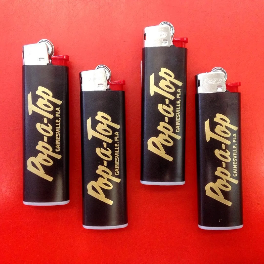
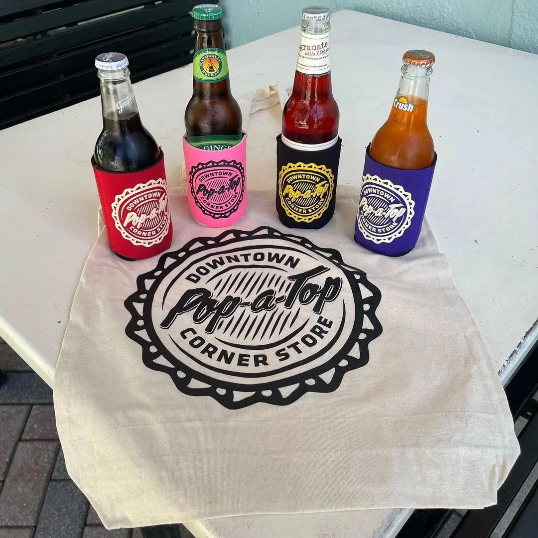
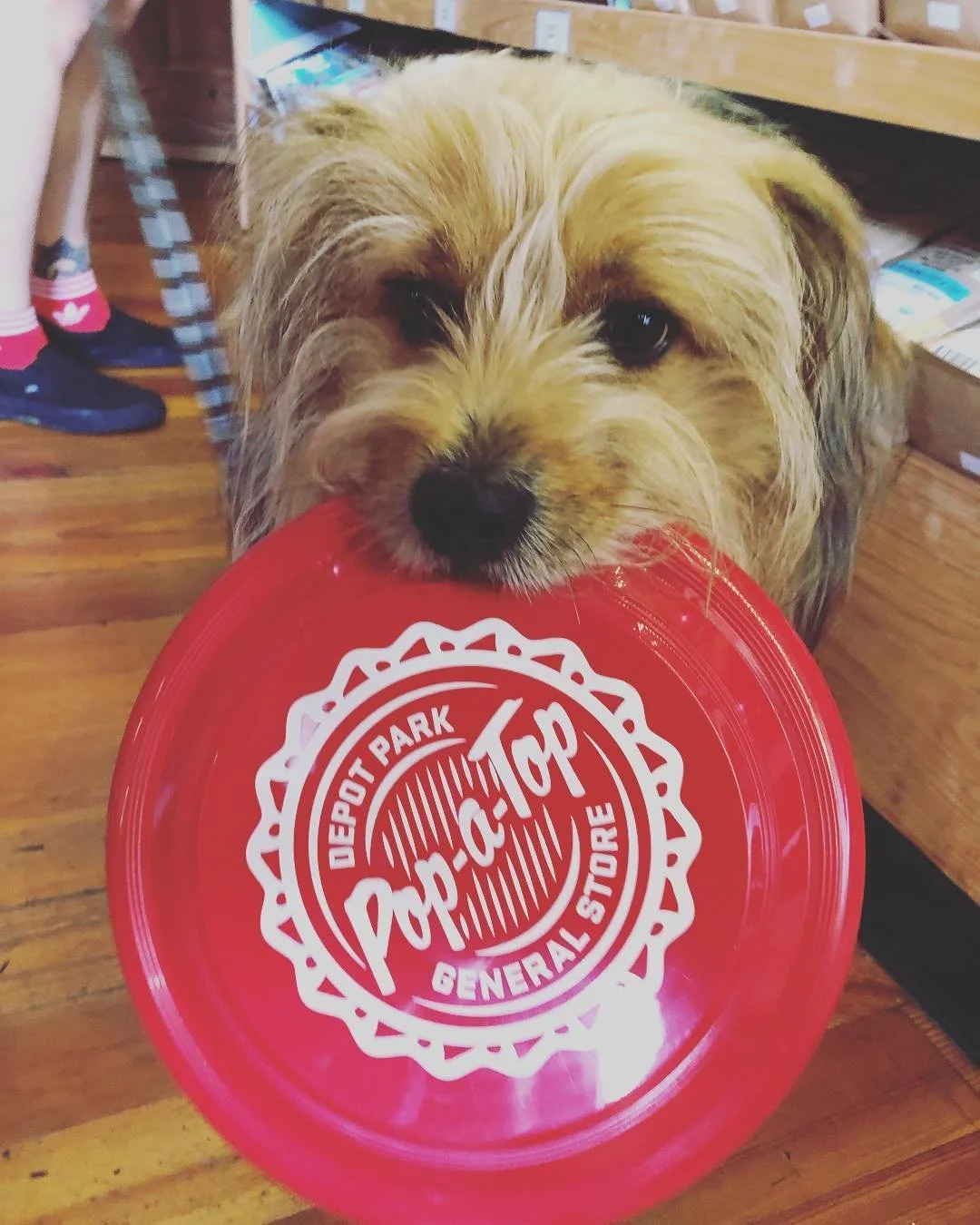
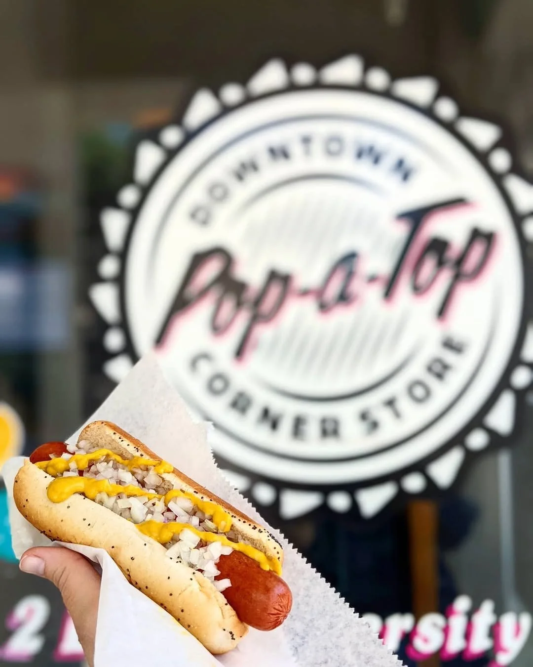
Pop-a-Top’s branding creates an inviting, memorable presence, making every visitor feel like a regular from day one. Blending nostalgia with modern design, it unites both locations under a cohesive brand while preserving each space’s unique character. Hand-painted signage reinforces its connection to classic craftsmanship, embedding Pop-a-Top into Gainesville’s landscape. Whether in the heart of downtown or by the tracks at Depot Park, it has become a beloved local staple.