

BRAND IDENTITY
The Top
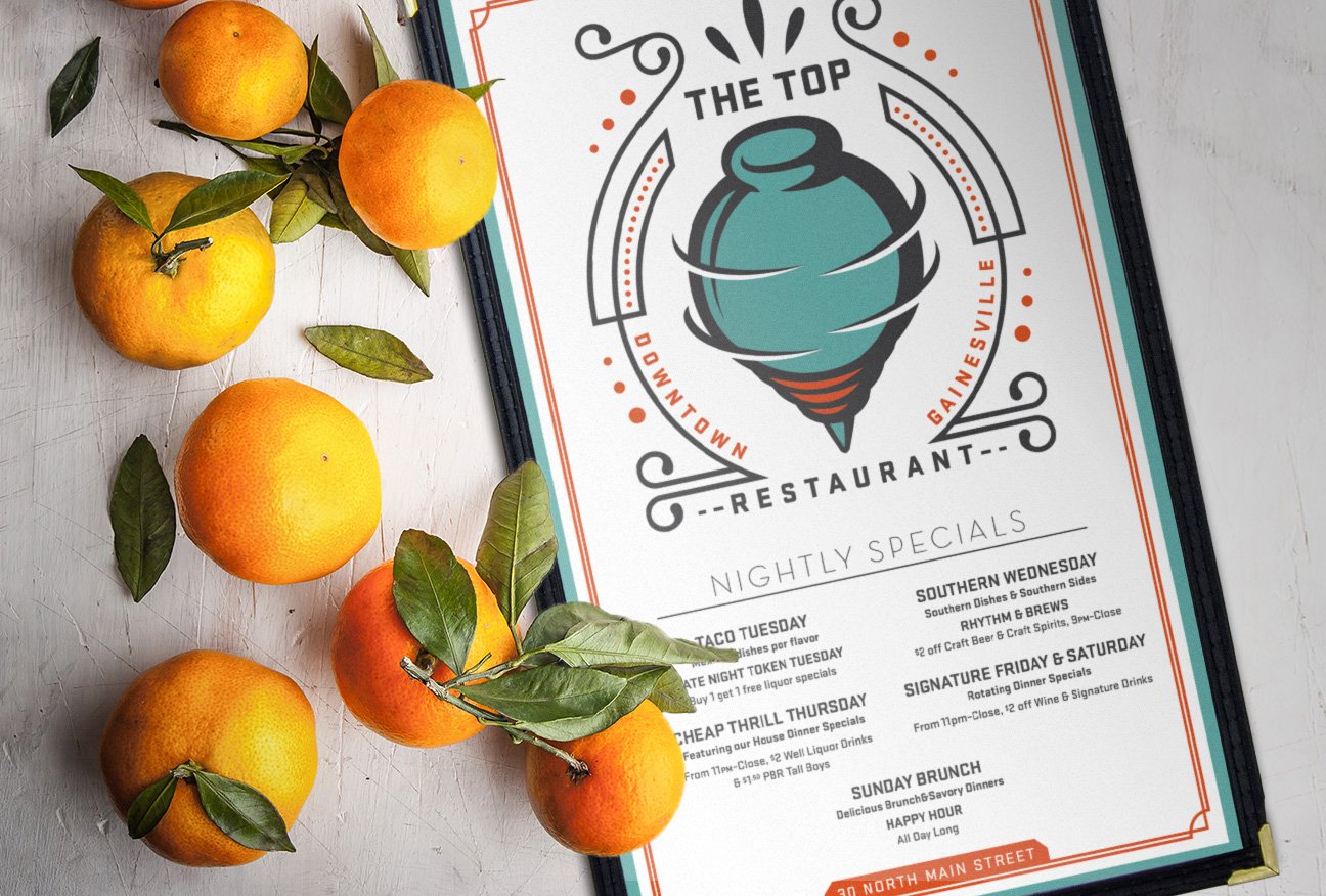
My first independently commissioned identity, still spinning 14 years later.The Top’s original hand-painted toy top logo already had recognition when I was commissioned to reimagine it in 2012. The new identity reflected the restaurant’s eclectic personality while expanding into a flexible system for signage, menus, promotions, apparel, and merchandise.
Scope
Brand identity refresh and art direction
Deliverables
Logo system, typography, menus, coasters, signage, packaging, apparel and merchandise
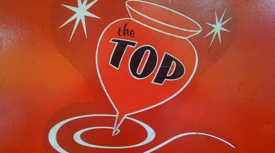
Original hand-painted logo, prior to the 2012 redesign
TOPPING THE TOP
The original hand-painted logo had already established the toy top as a recognizable symbol. The challenge was to preserve that familiarity while giving the identity greater structure, distinction, and versatility.
The new emblem transformed the loose illustration into something energetic, slightly eccentric, and durable enough to represent the restaurant across a much broader range of applications. Its typography and ornamentation drew from The Top’s interior—part Art Deco lounge, part neighborhood haunt, part collection of objects accumulated over time.
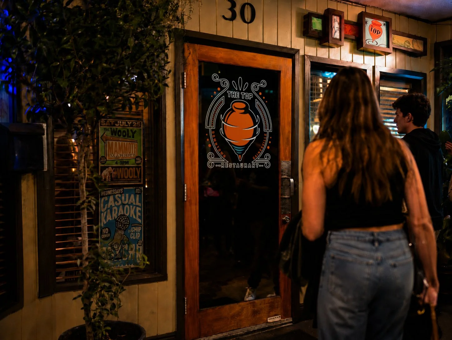
BUILT INTO THE RESTAURANT
The identity was designed to move from emblem to environment—remaining recognizable on the front door, at the table, behind the counter, and throughout the restaurant’s everyday service.
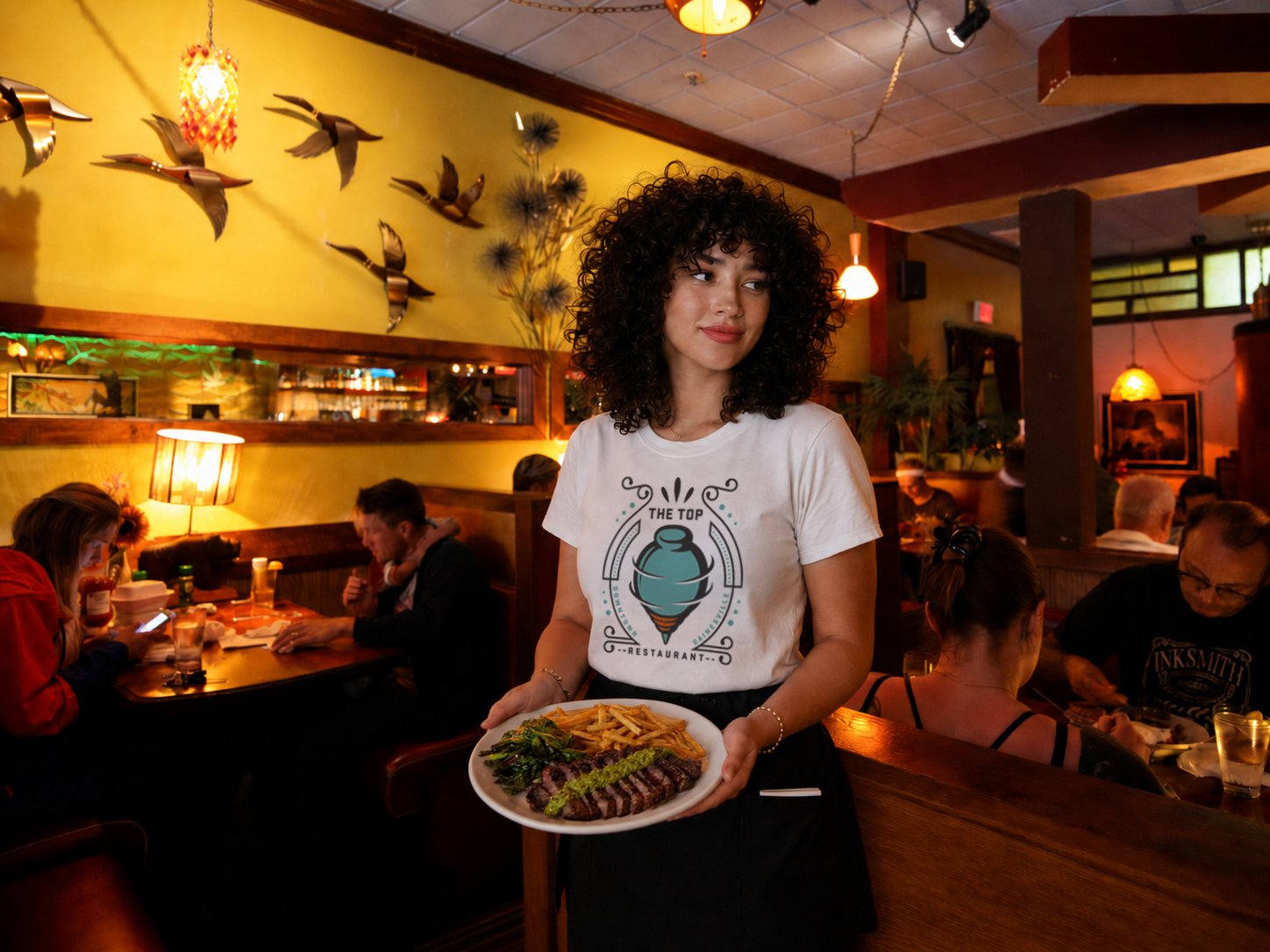
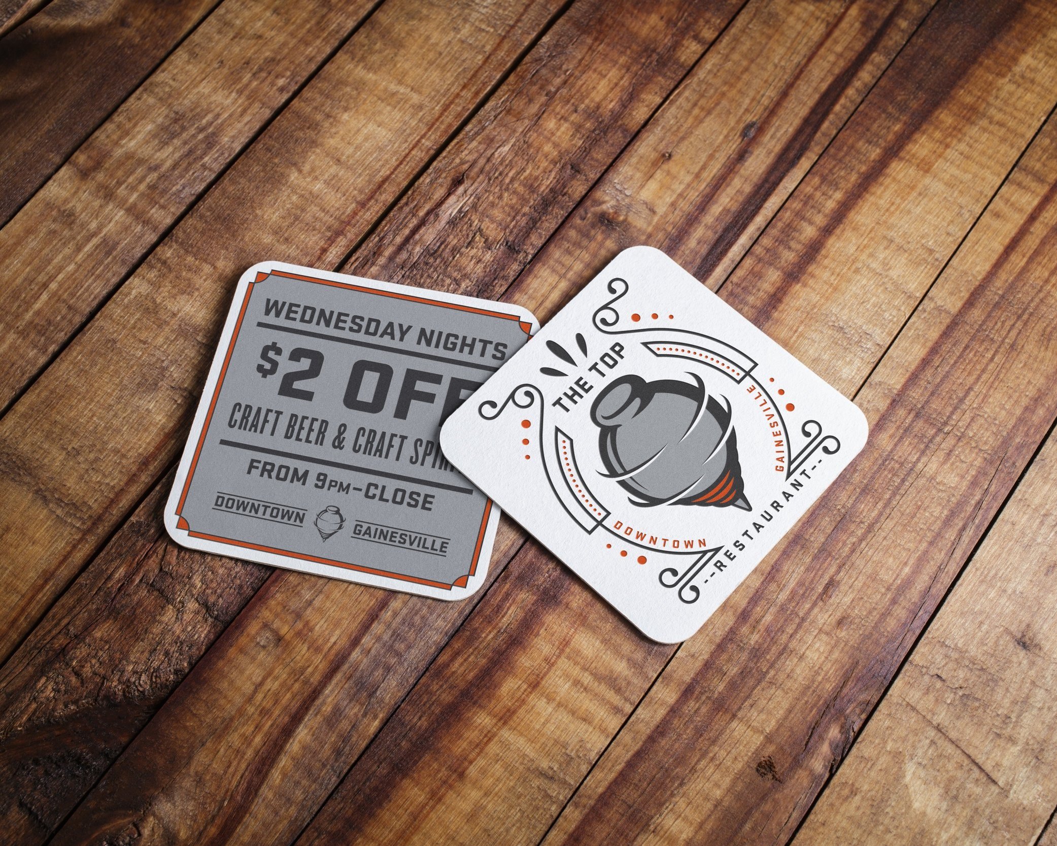
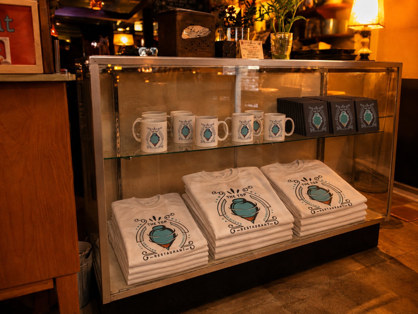
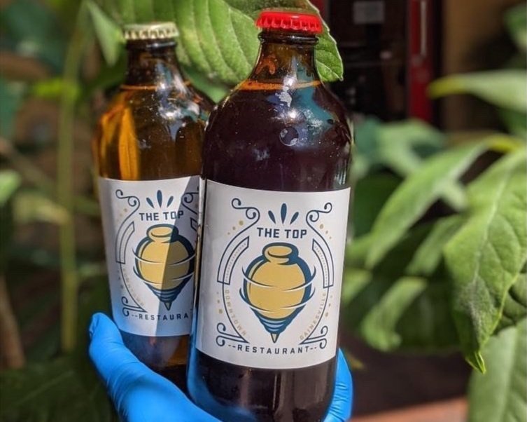
Fourteen years later, the identity remains prominently displayed, actively used, and closely associated with the restaurant.

Its longevity is the clearest measure of the project’s success. The mark became familiar by remaining distinctive, with enough flexibility to grow with the business and enough specificity that it could only belong to The Top.