
EDITORIAL DESIGN
Warrington Magazine
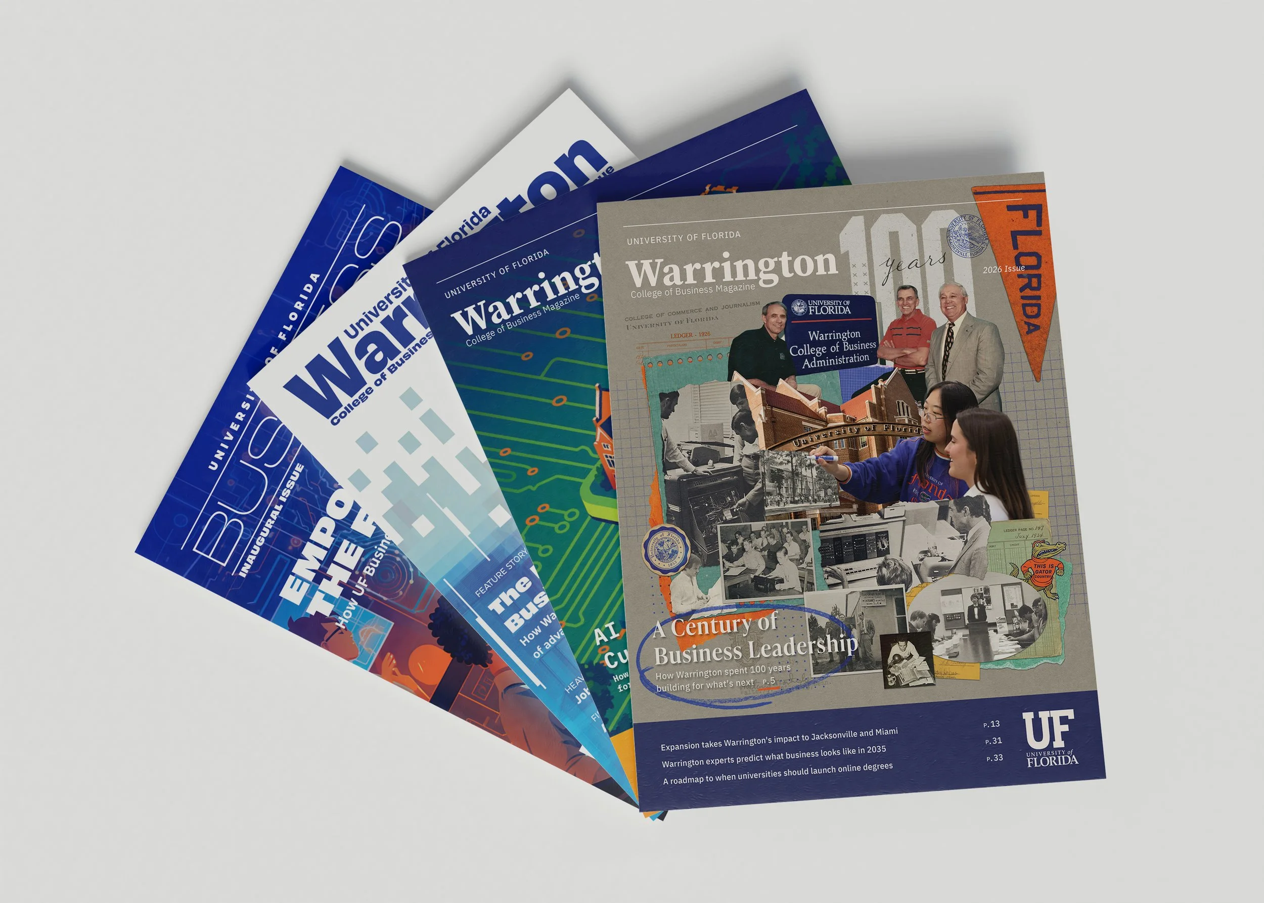
Building an editorial identity across four annual issues.Warrington Magazine has evolved from a new publication launched as UF Business into a more distinctive editorial identity. Each edition builds on an established design system while introducing new approaches to typography, imagery, and visual storytelling.
Role
Lead Editorial Designer
DELIVERABLES
Publication identity, masthead, typography, image direction, illustration, and layout
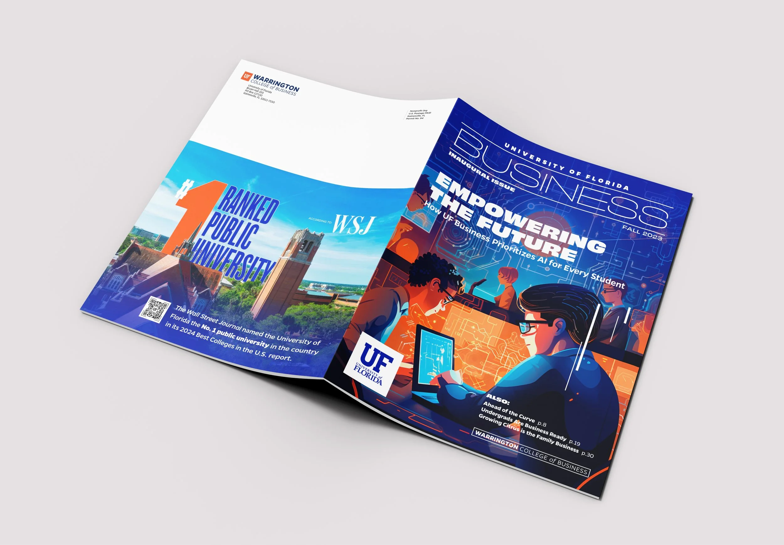
DESIGNING THE PUBLICATION WHILE DEFINING ITS IDENTITYThe inaugural issue required a repeatable editorial system capable of supporting major features, research stories, student experiences, alumni profiles, and institutional reporting.
Because the magazine’s identity was still taking shape, the system also needed room to evolve. The goal was to create continuity across the publication while allowing individual issues and stories to develop their own visual character.
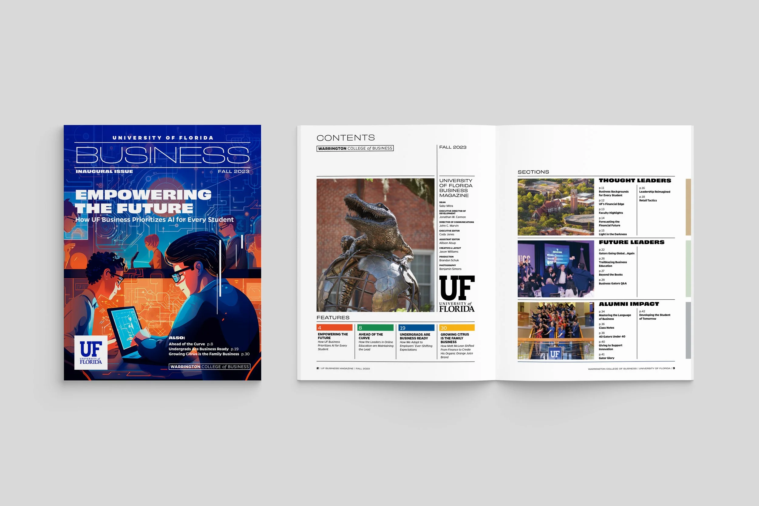
2023 — Launch
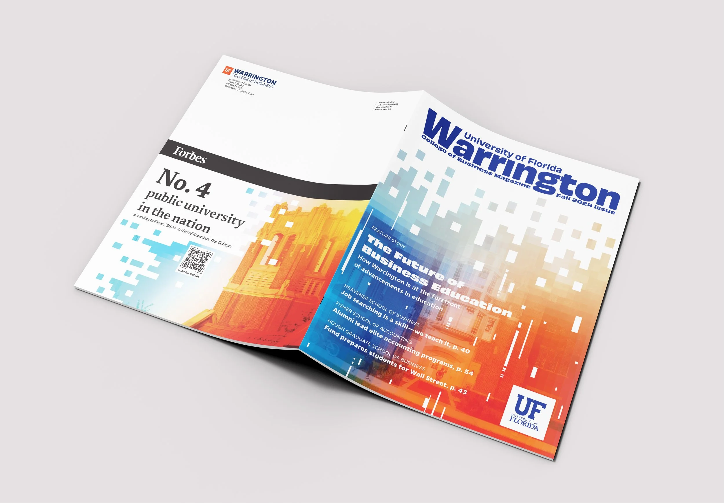
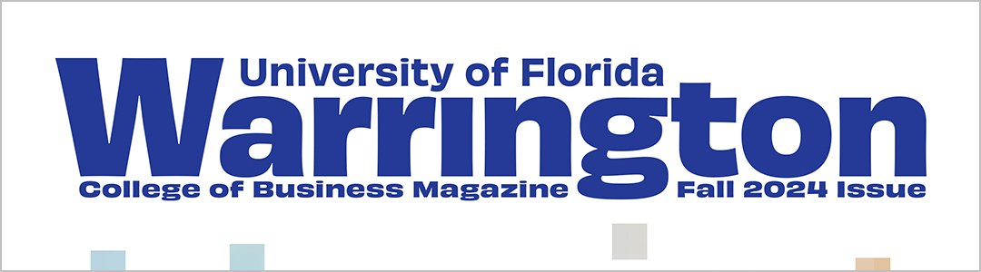
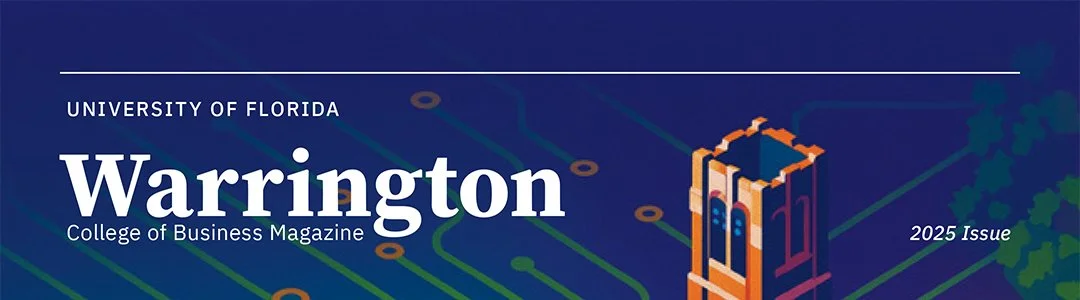
A MASTHEAD FINDING ITS VOICEThe masthead evolved alongside the magazine’s identity. The inaugural issue used a wide, technical treatment built around the broad title Business. In 2024, the shift to Warrington brought the college name forward at an intentionally oversized scale, establishing ownership and immediate recognition.
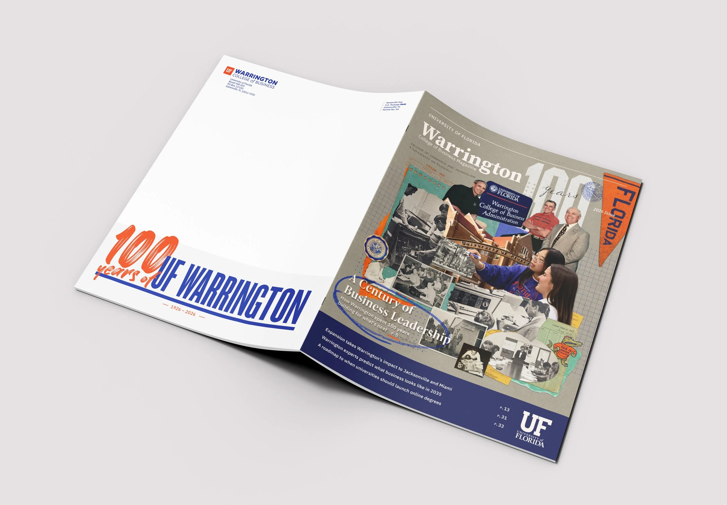
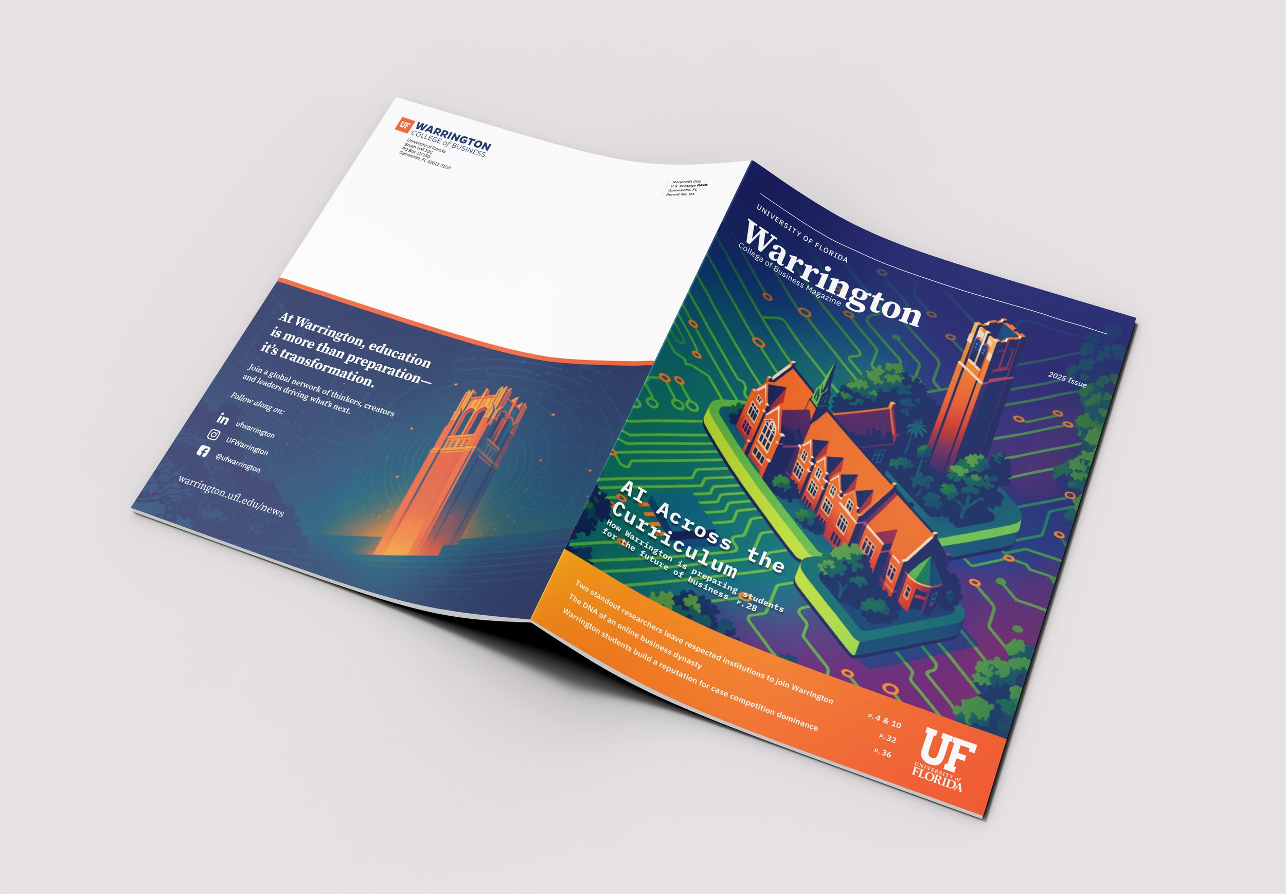
By 2025, a more restrained serif treatment gave the publication a quieter editorial authority. That approach carried into the 2026 centennial issue, where the masthead takes a supporting role to the cover's layered historical imagery and anniversary typography.
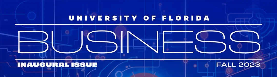
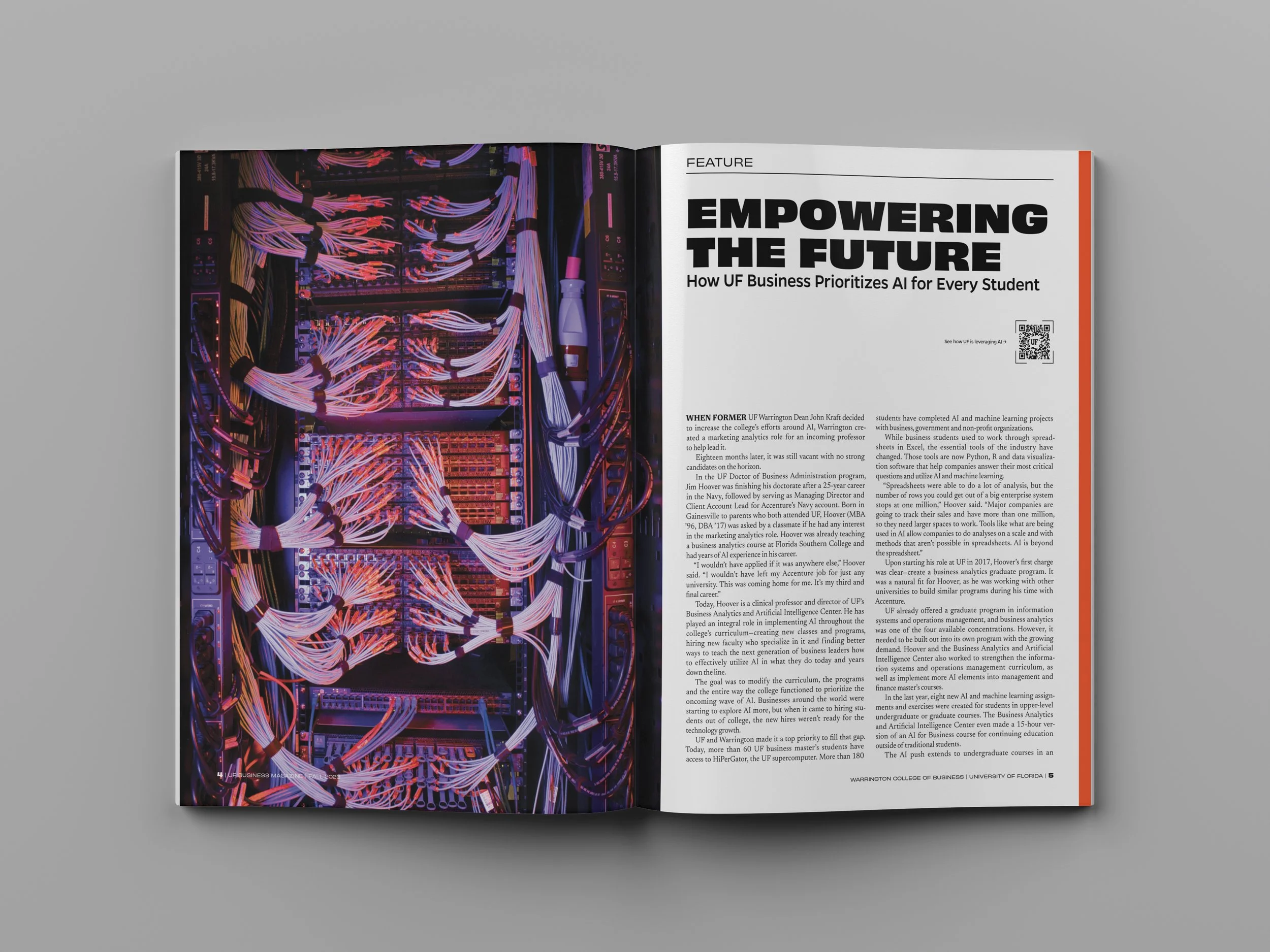
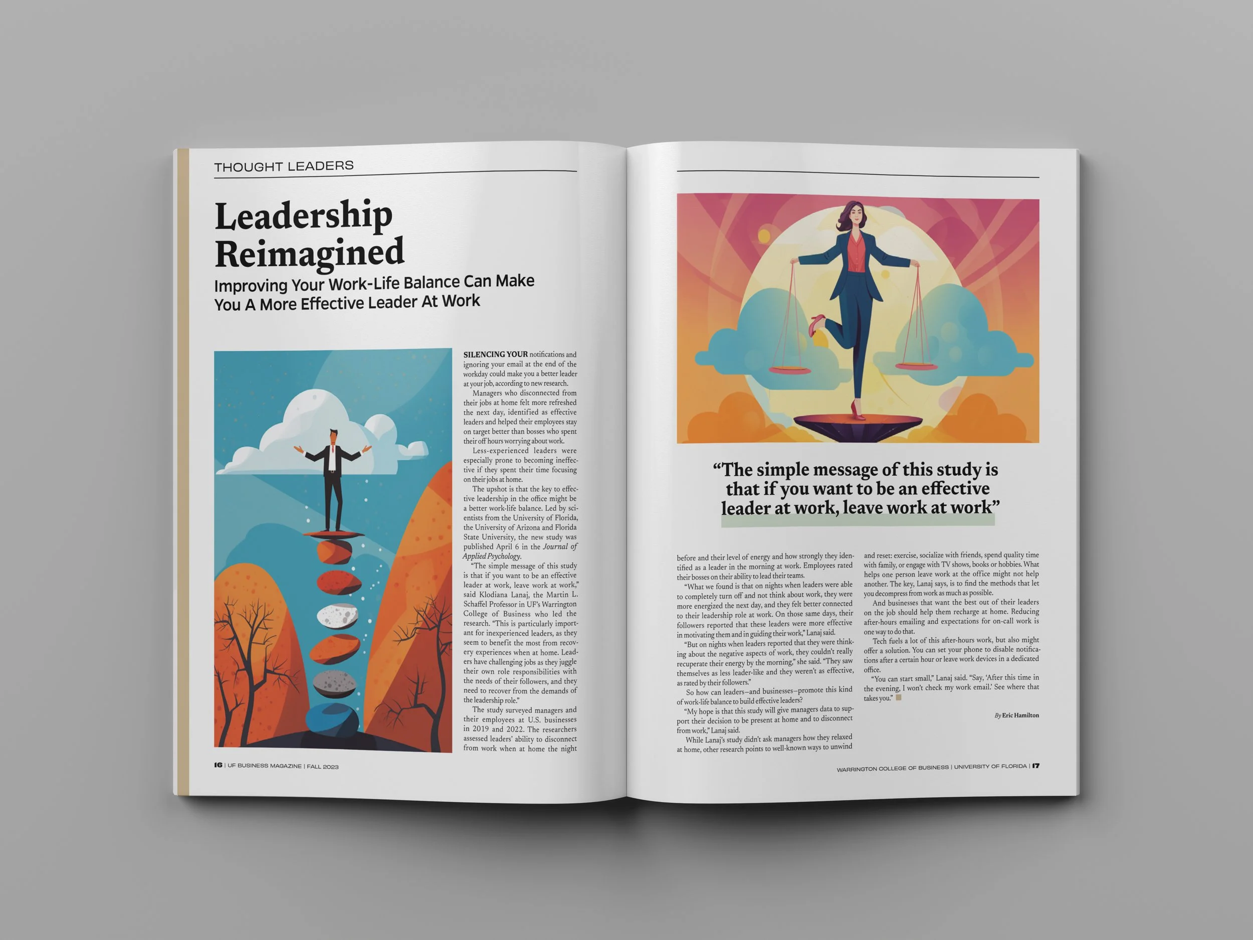
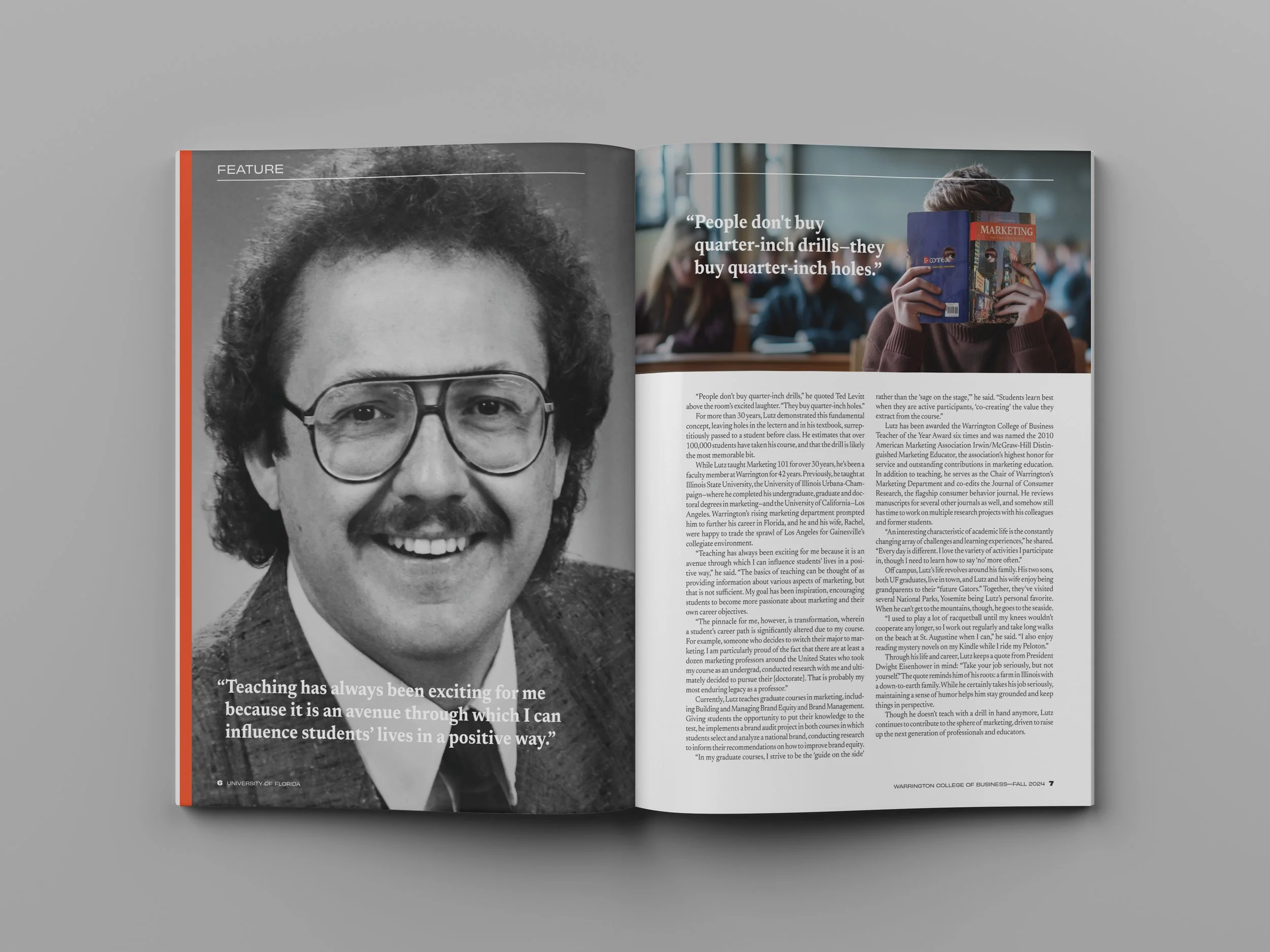
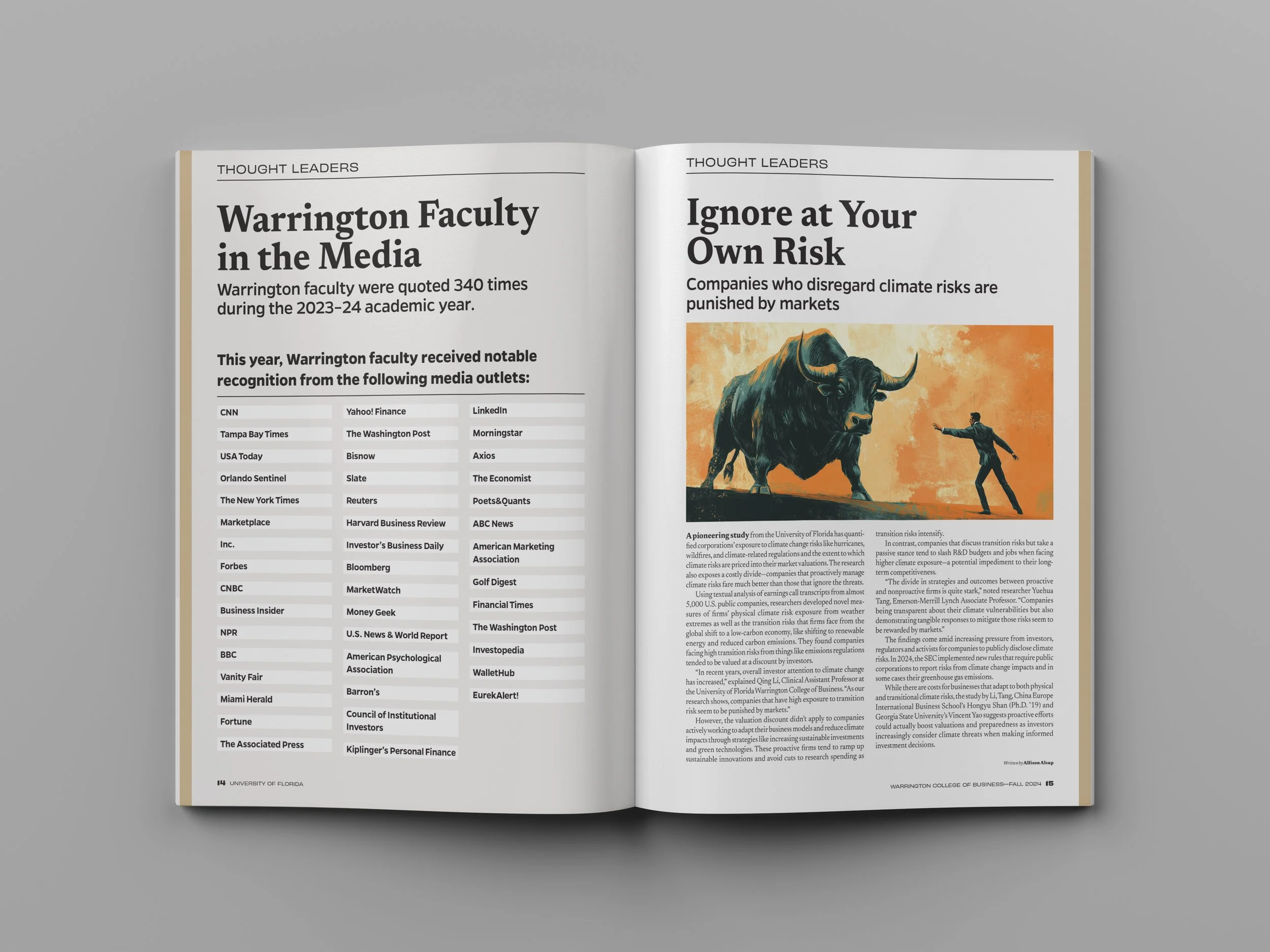
ISSUE 01 — ESTABLISHING THE FOUNDATIONThe inaugural issue established the magazine’s editorial foundation. A modular grid, recurring departments, and a clear typographic hierarchy created consistency across feature stories, research briefs, student experiences, and alumni content.
Published as UF Business, the first issue introduced a new long-form platform for the college while defining the structure future editions could inherit and refine.
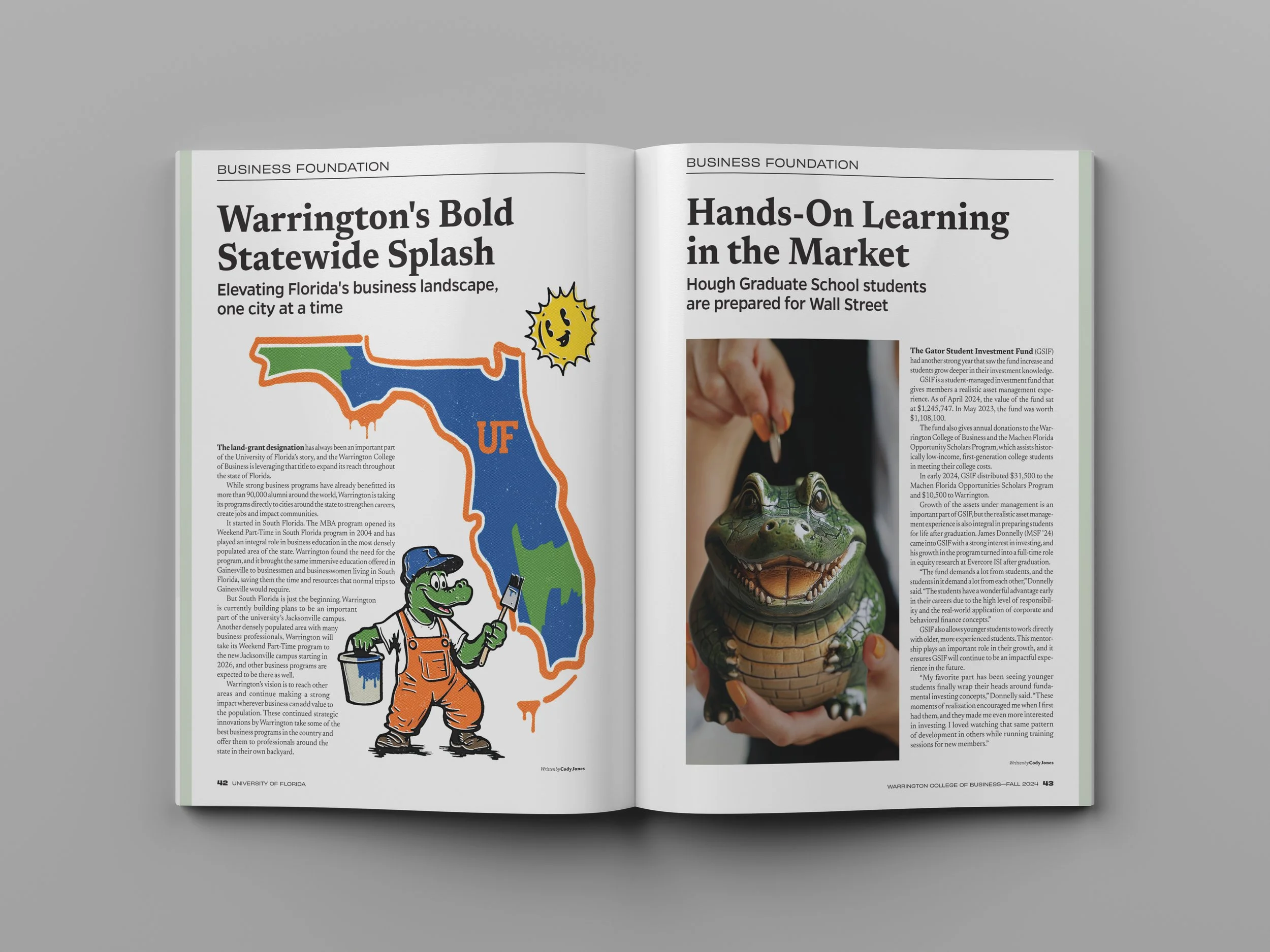
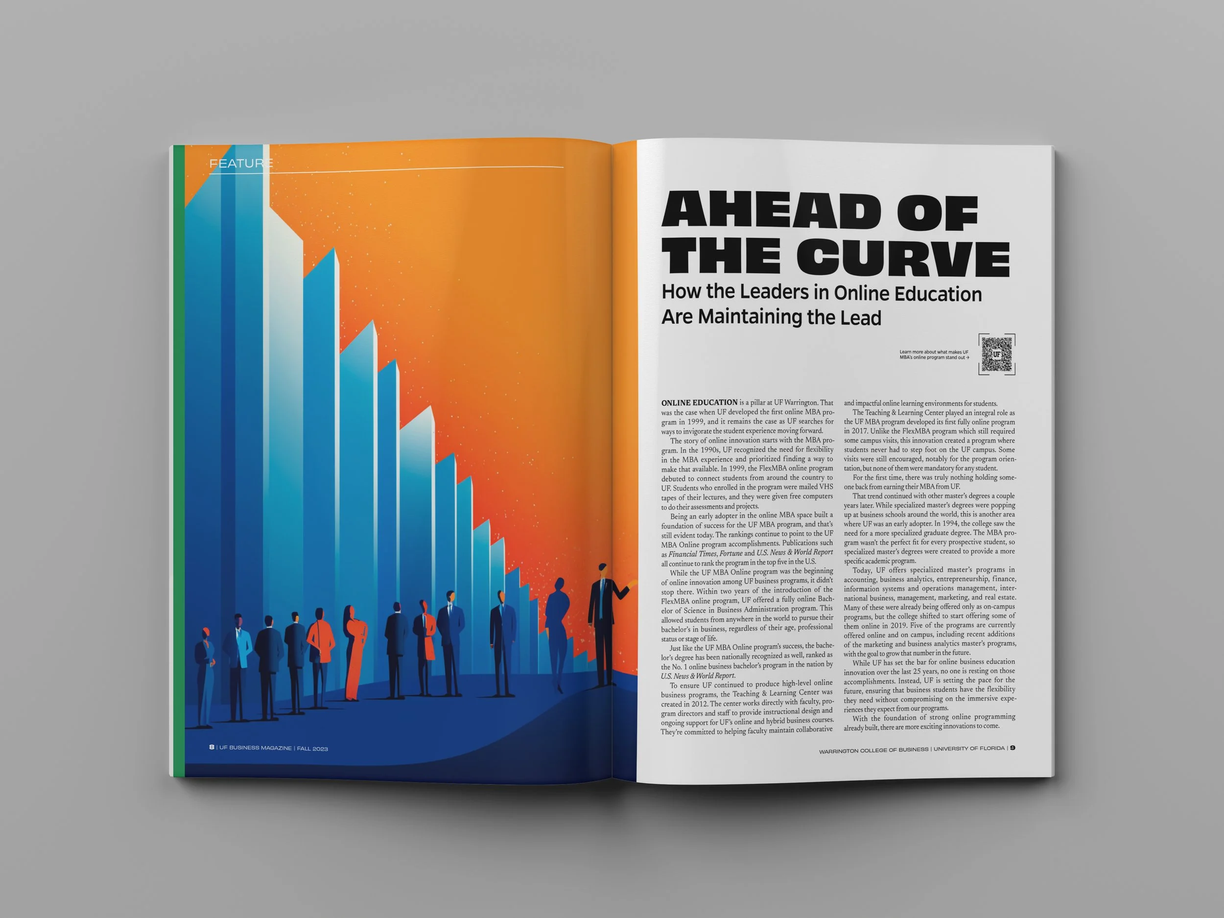
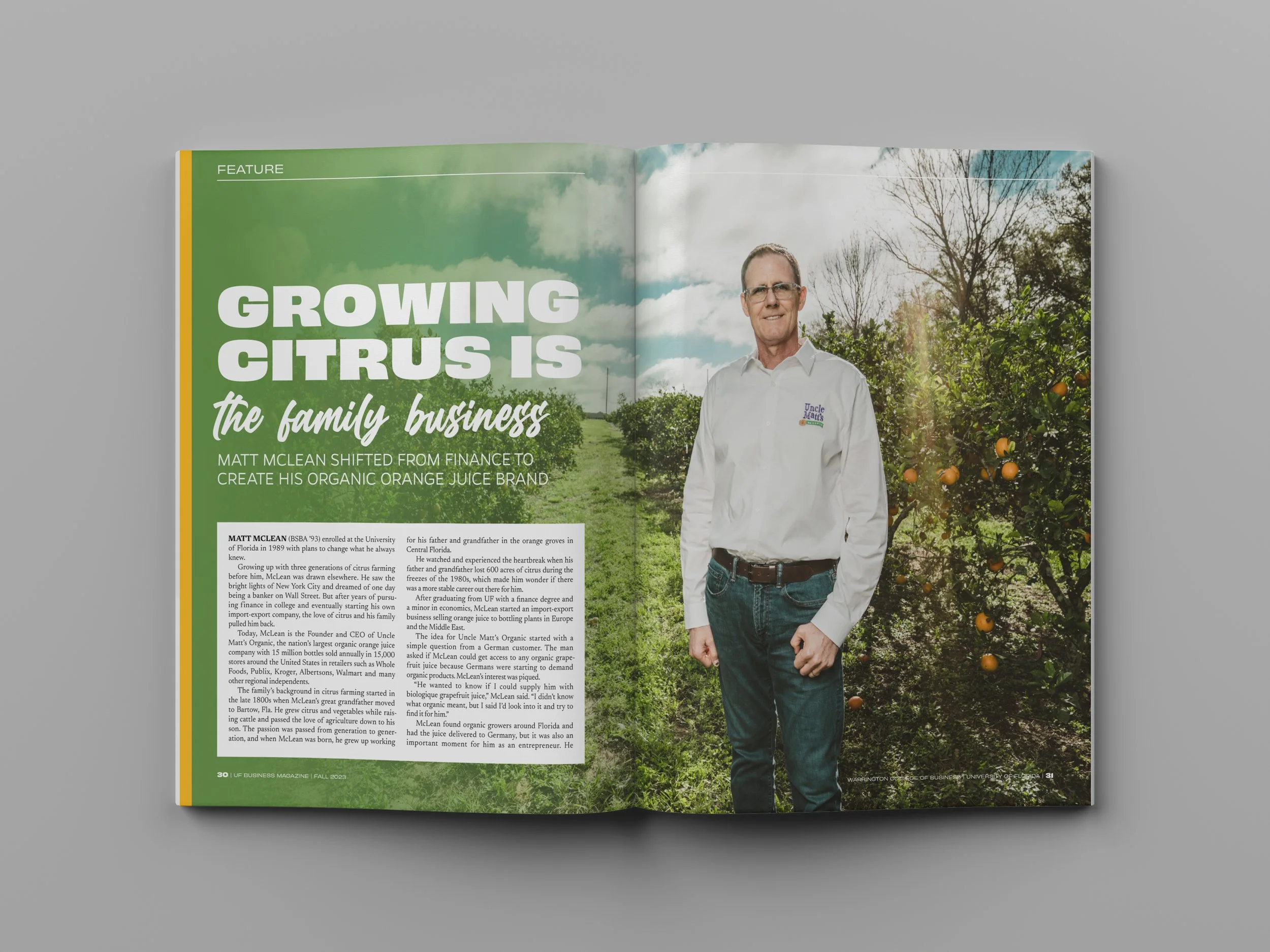
ISSUE 02 — DEFINING A DISTINCT WARRINGTON IDENTITYThe second issue brought the college more clearly into the publication’s identity. The name shifted from UF Business to Warrington, and the oversized masthead gave the title greater presence and recognition.
Inside, the editorial structure became more focused while the visual system gained greater range through serif display typography, photography, illustration, and UF-inspired graphic elements. The magazine began to feel less like a new institutional publication and more like a distinct Warrington product.
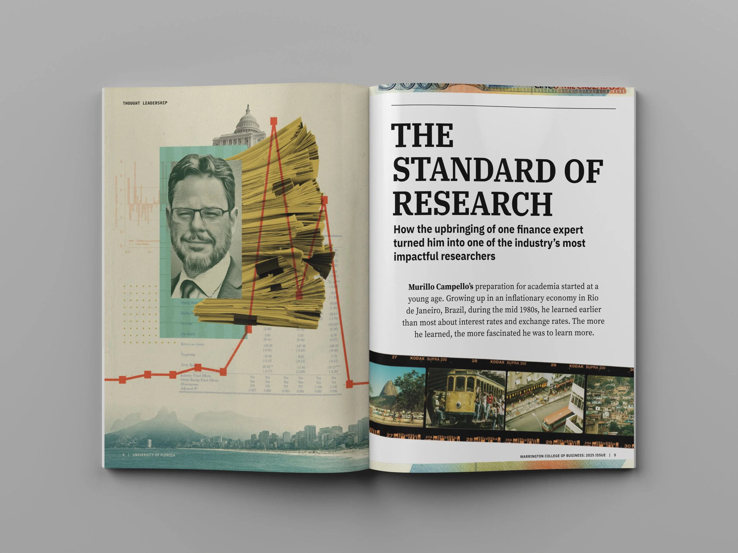
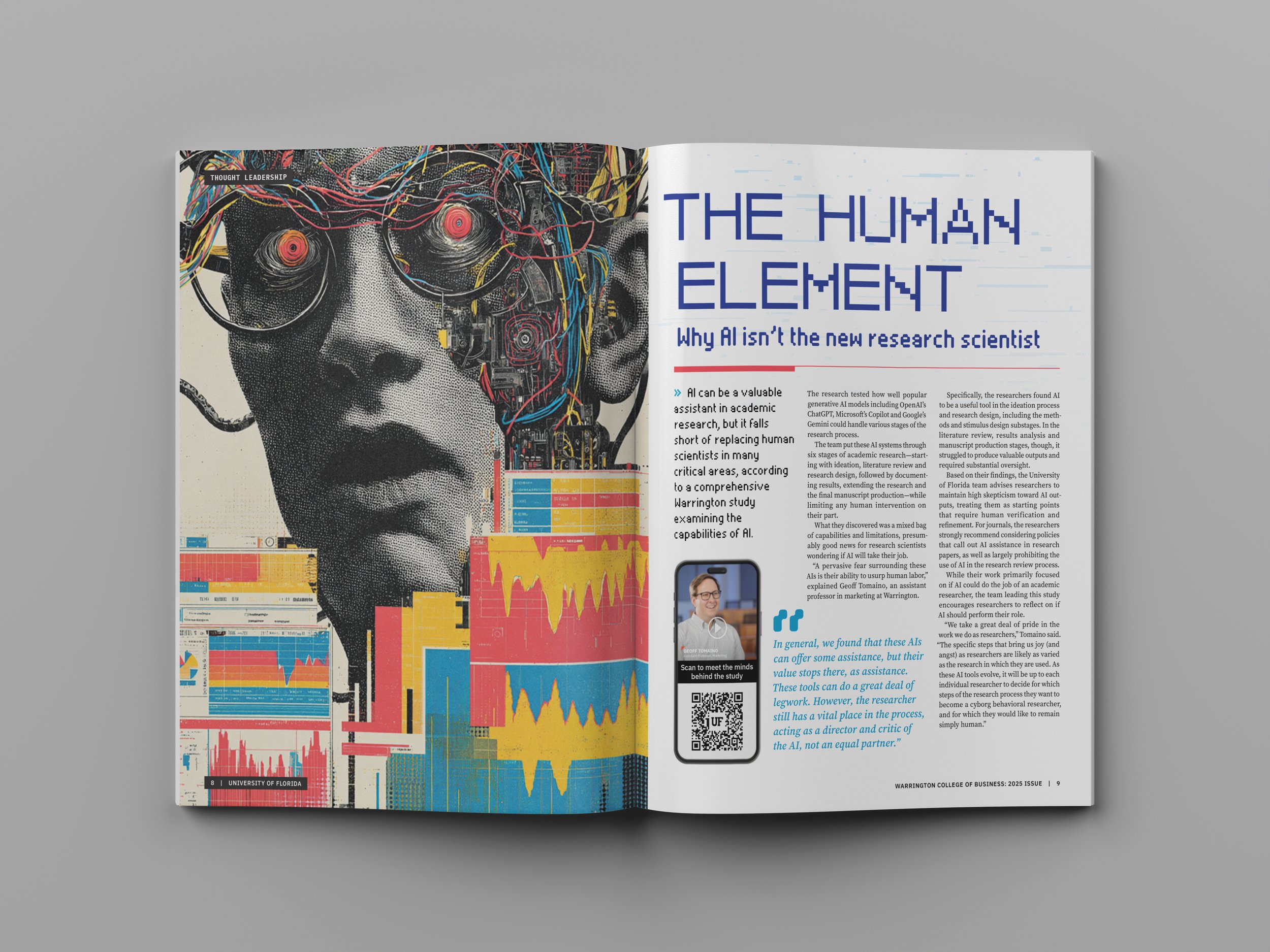
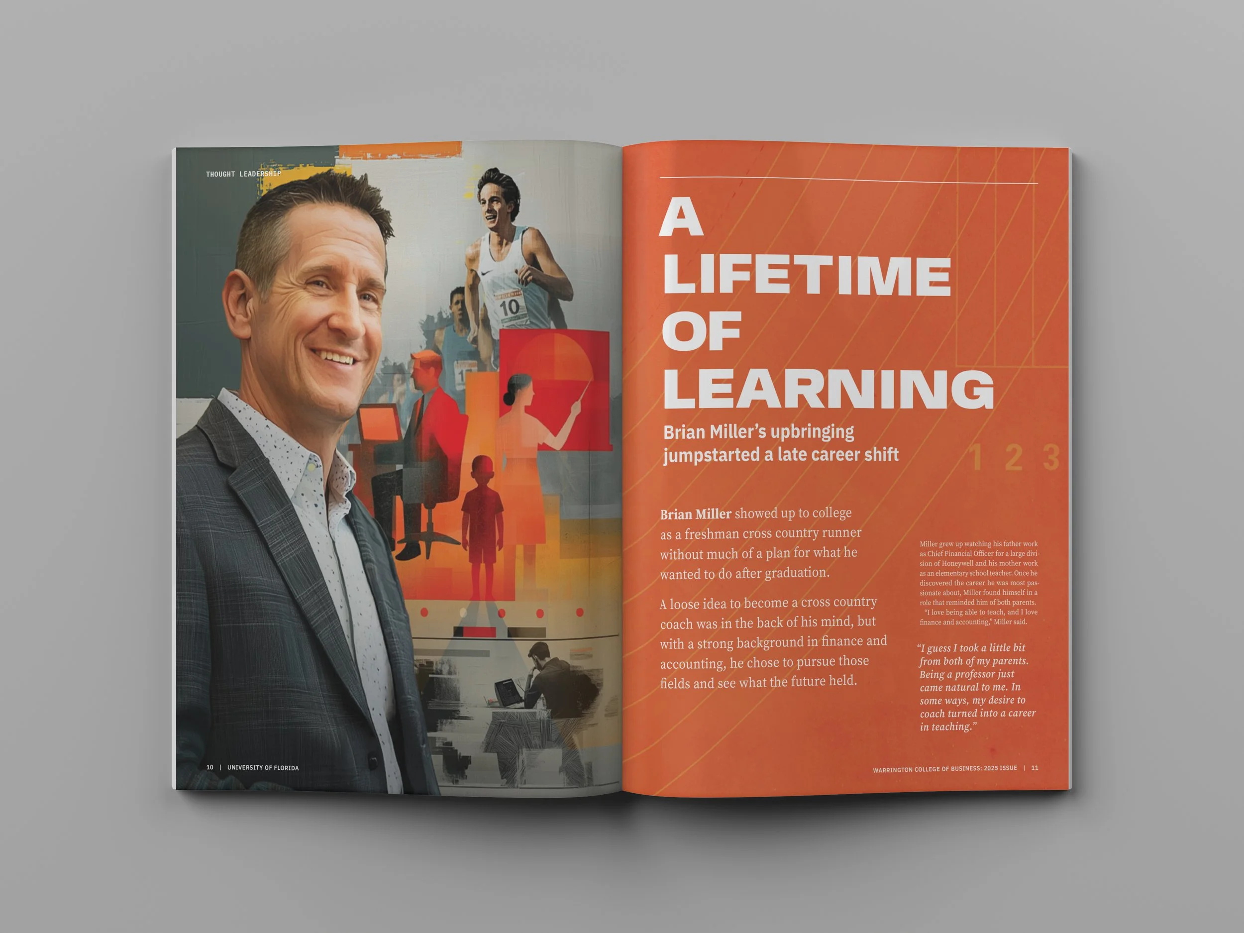
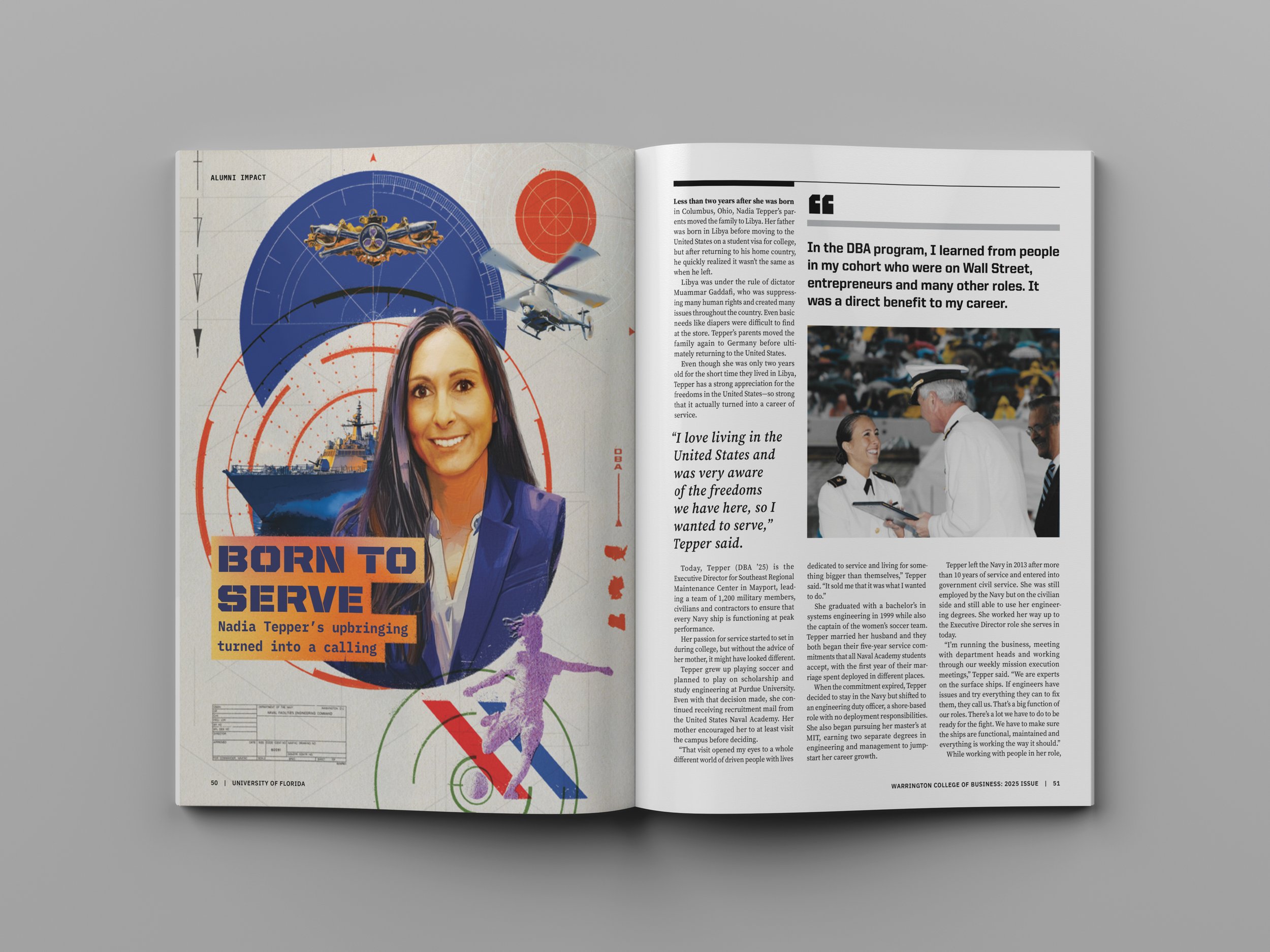
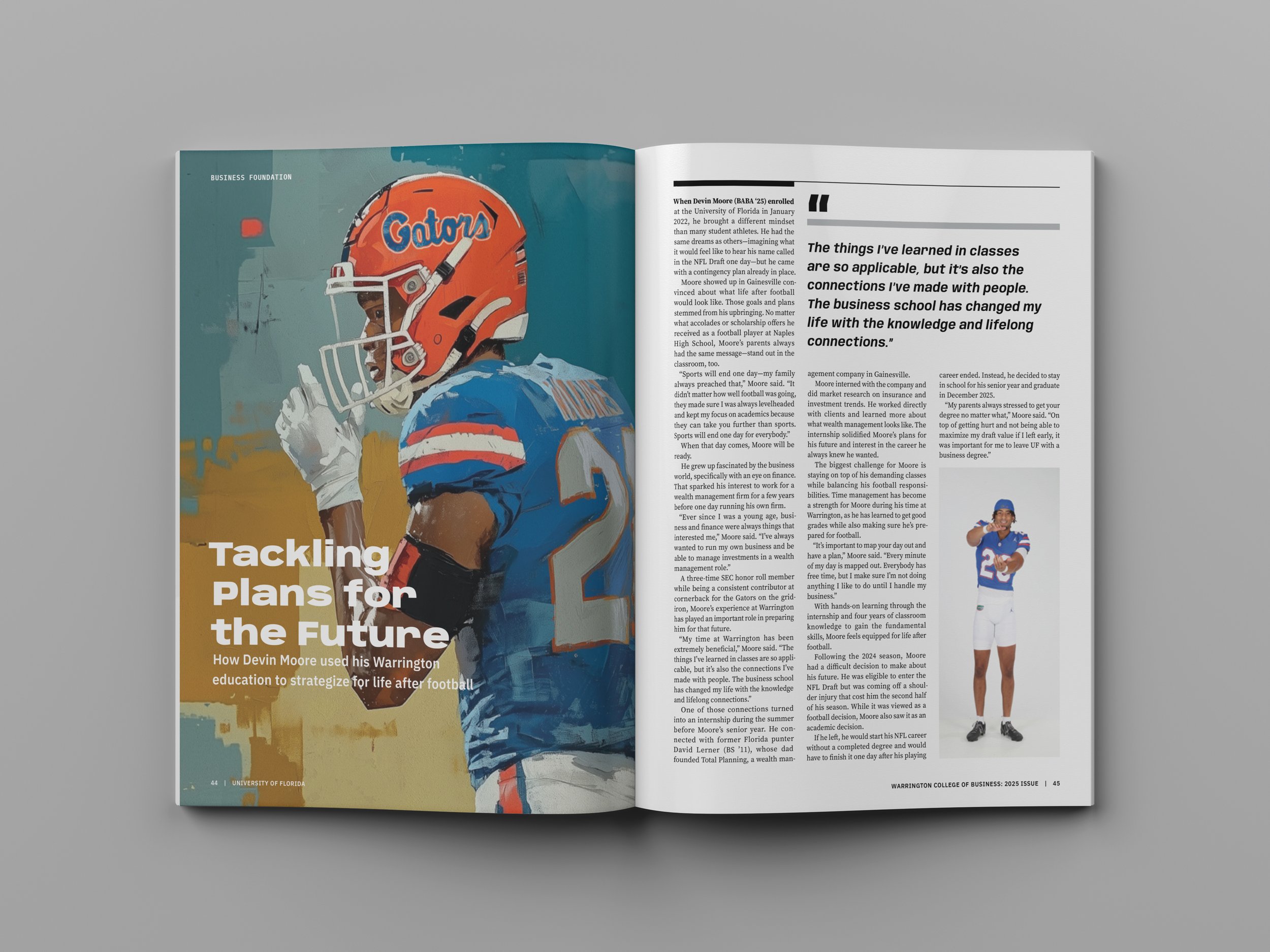
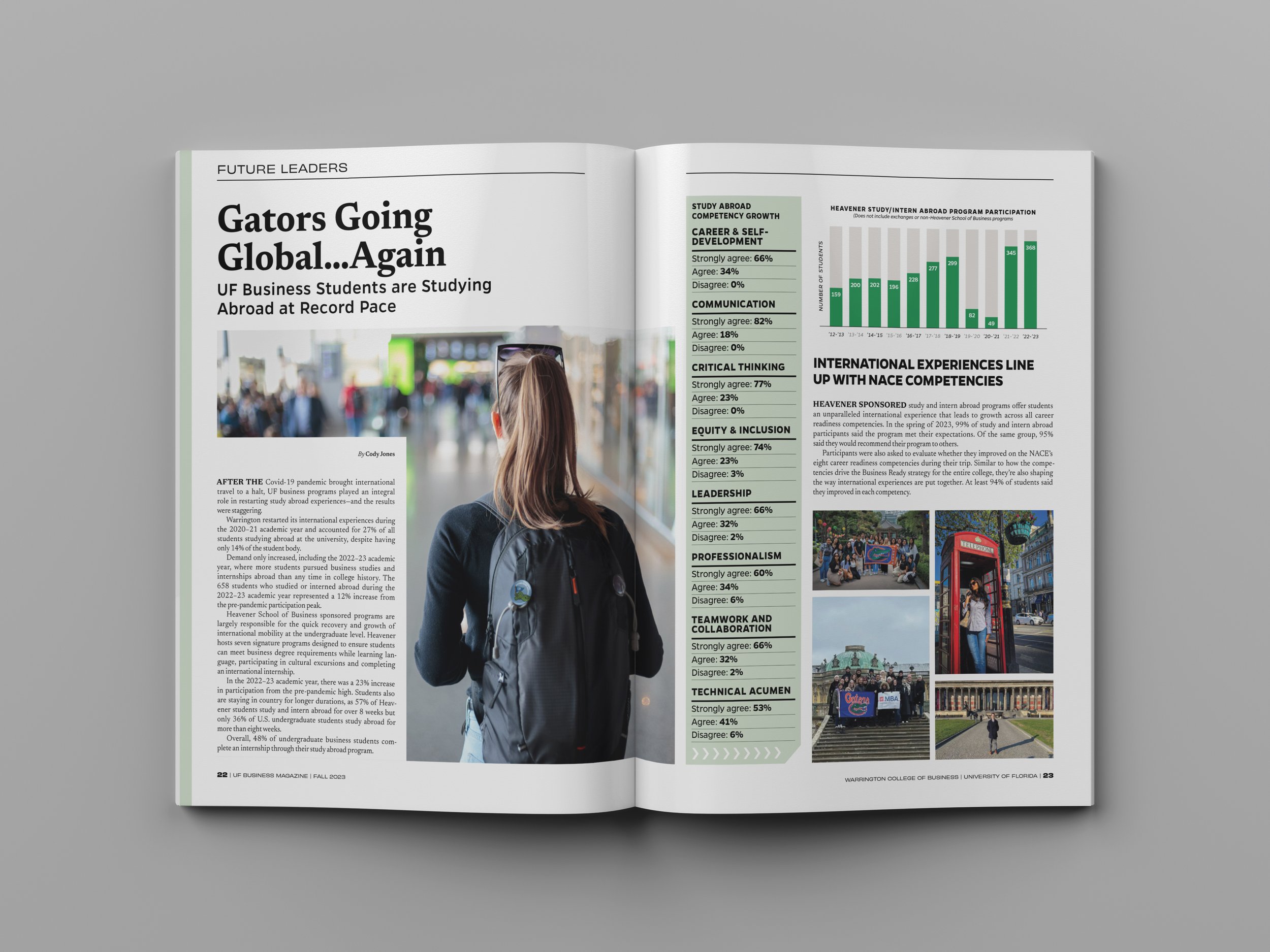
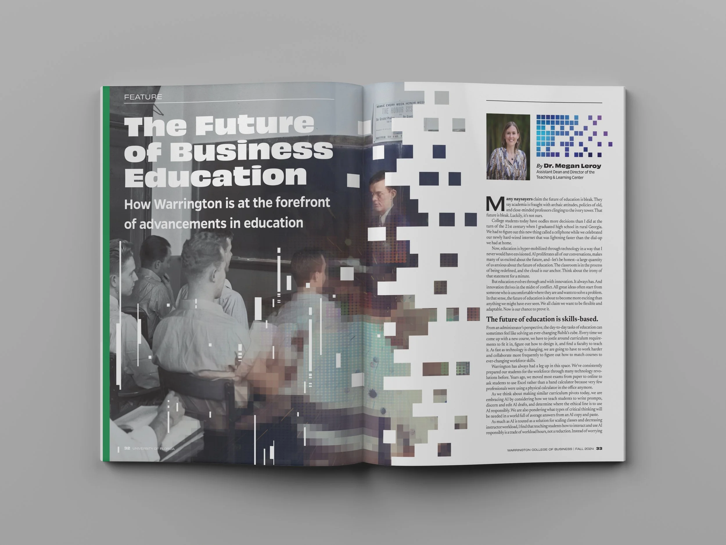
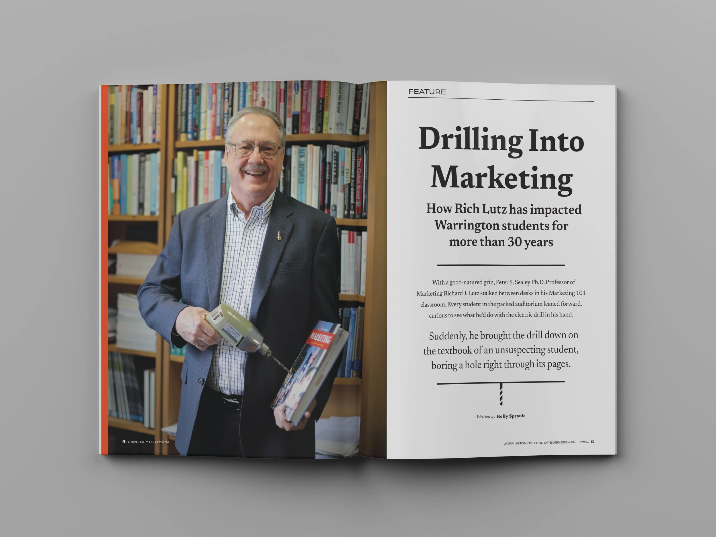
ISSUE 03 — EXPANDING THE EDITORIAL VOICEBy the third issue, the magazine had developed a more confident and expressive editorial voice. A refined serif masthead brought greater authority to the cover, while feature openers used collage, illustration, archival material, portraiture, and typography to interpret each subject more deliberately.
Individual stories were given distinct visual identities, but shared hierarchy, pacing, and typographic discipline kept the publication cohesive from beginning to end.
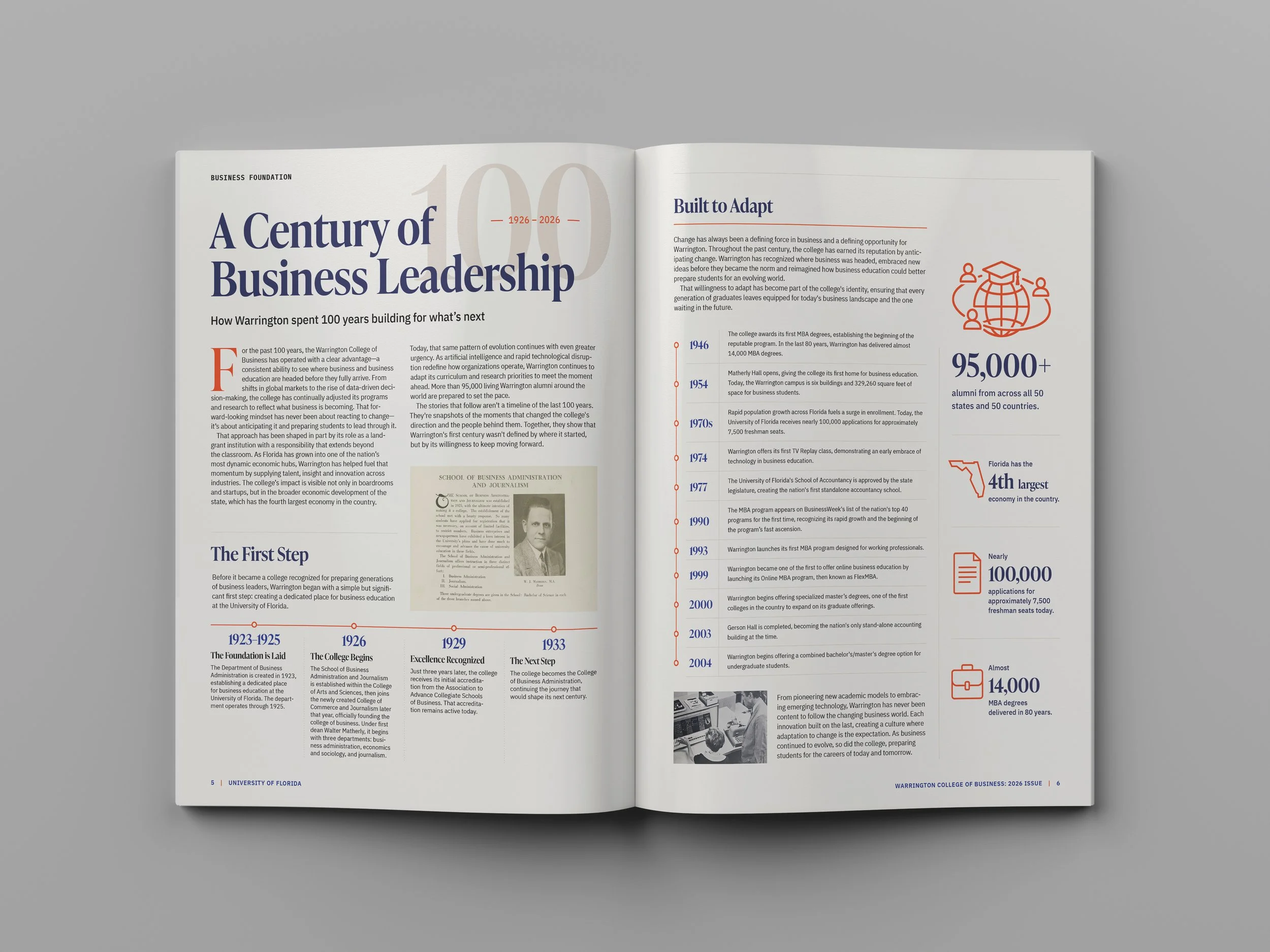
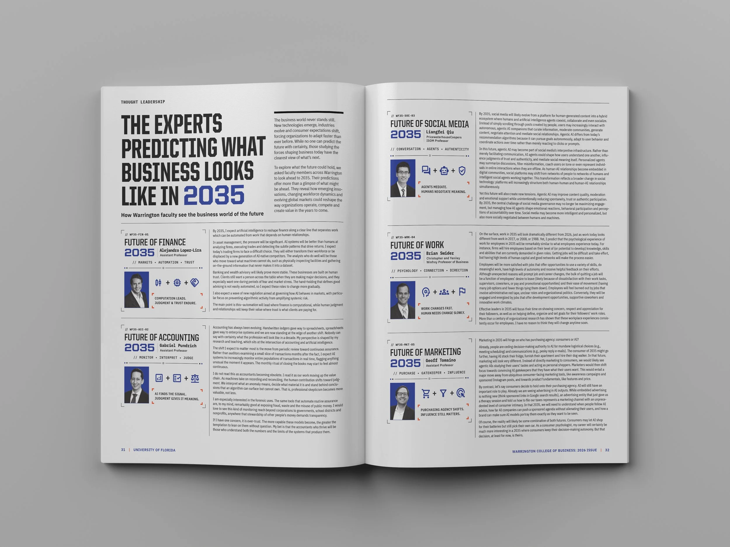
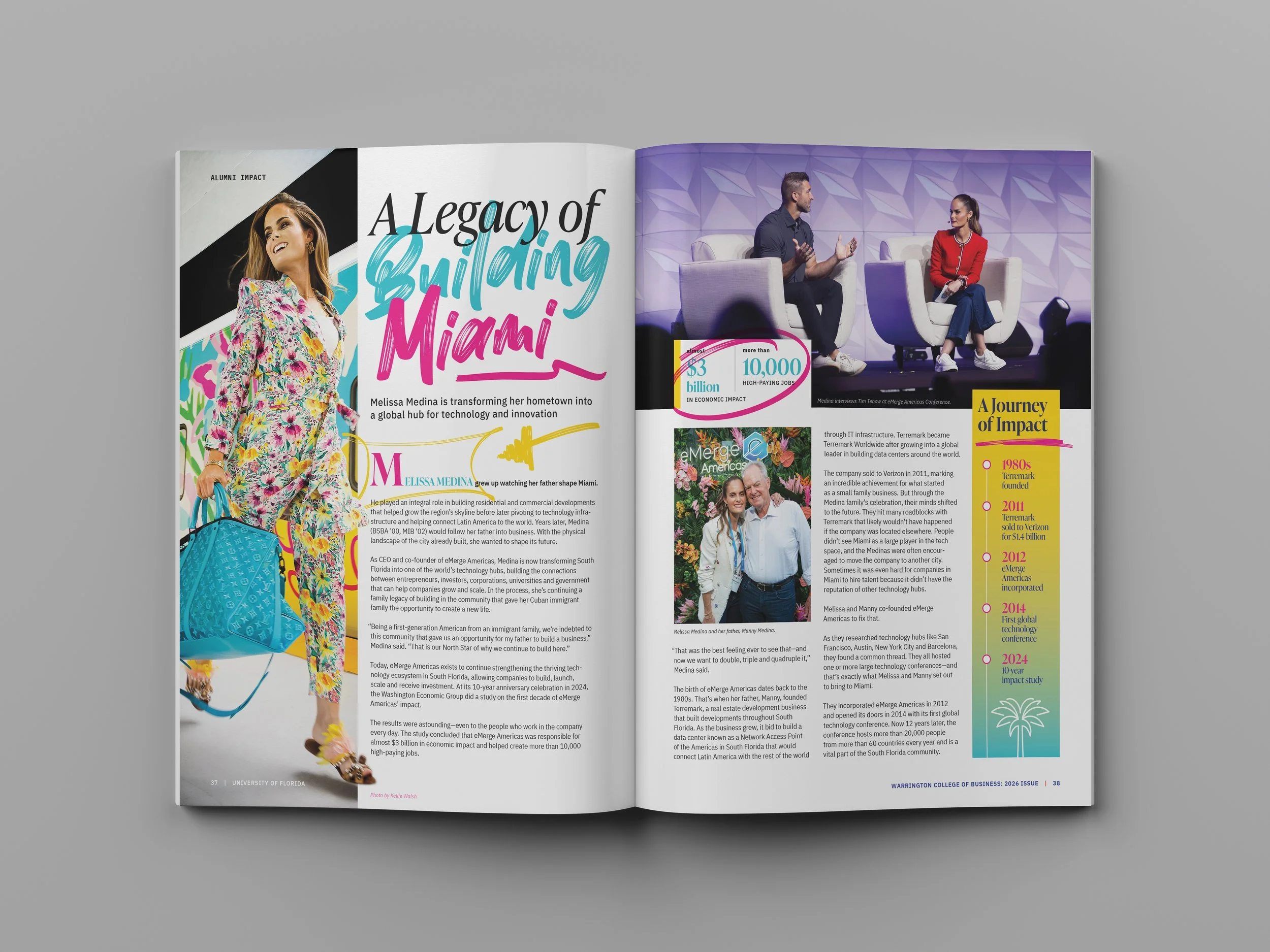
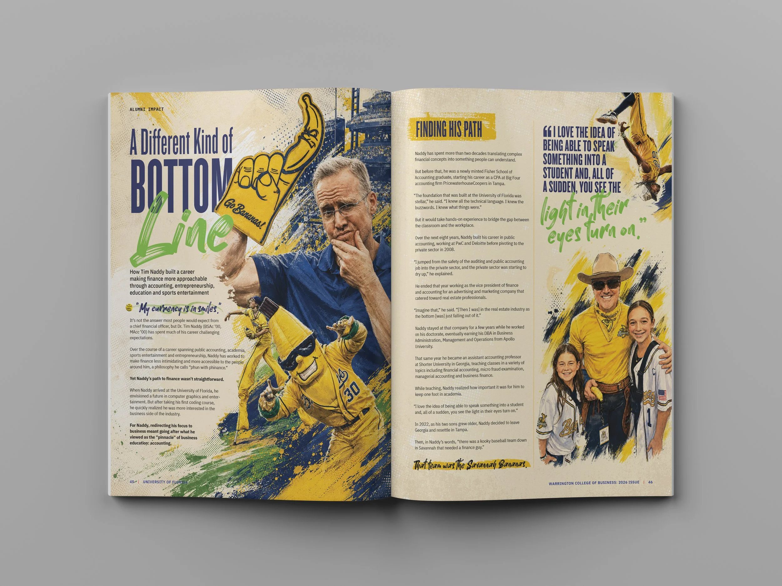
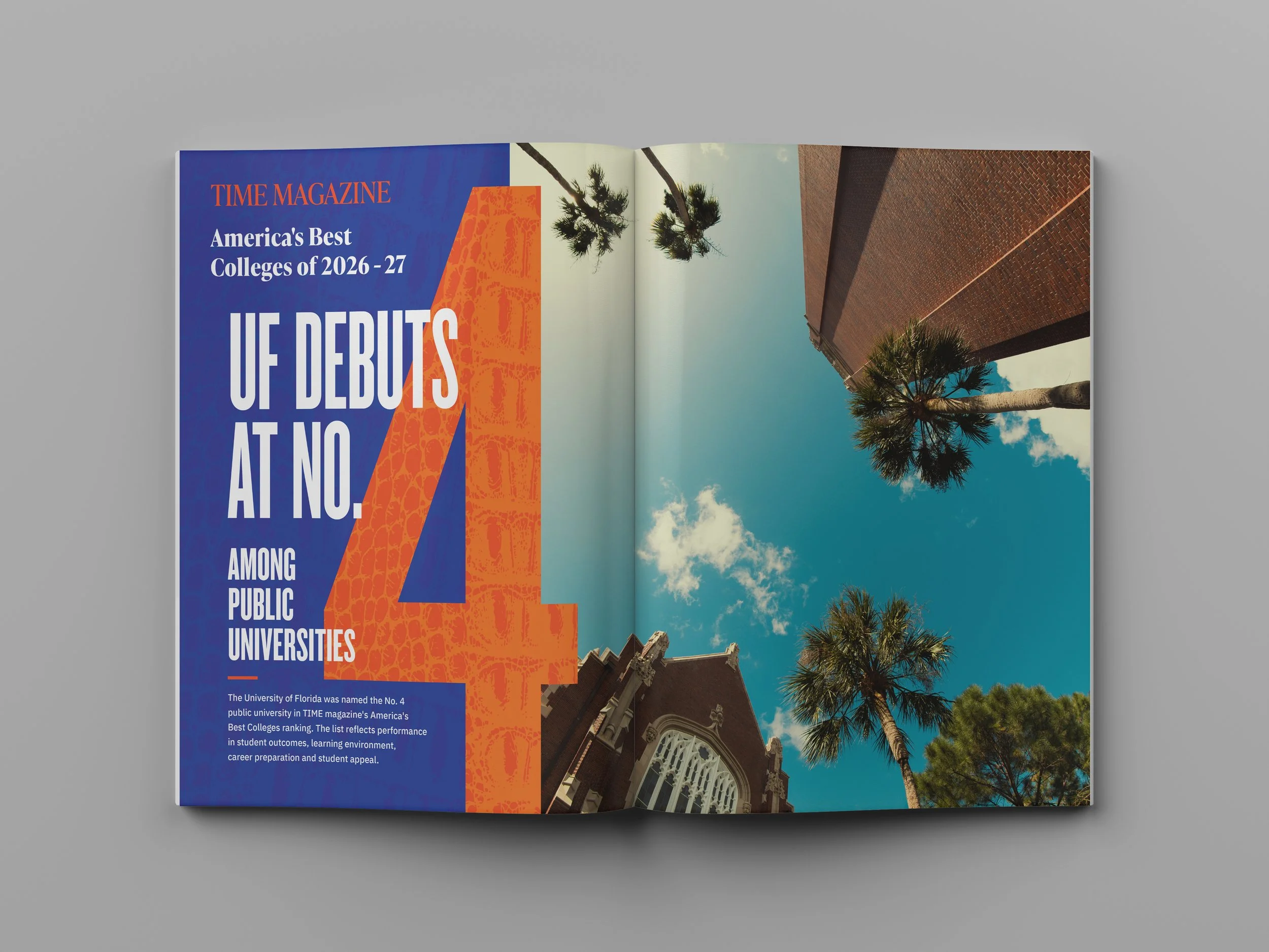
ISSUE 04 — MARKING A CENTURYWarrington's 100th anniversary introduced a different editorial challenge: celebrating the college's history without turning the entire publication into a retrospective. The cover combines archival photography, historical memorabilia, contemporary portraits, and layered typography, while the lead feature uses timelines, archival imagery, and data to make a century of history accessible and engaging.
Beyond the centennial feature, the issue continues to explore different visual approaches. Research stories rely on structured typography and information graphics, while alumni features introduce expressive illustration, custom lettering, and energetic collage. The result is an anniversary issue with its own visual character, grounded in the editorial system established over the previous three editions.
ONE PUBLICATION, MULTIPLE VISUAL LANGUAGESA business-school magazine must accommodate radically different subjects—from academic research and emerging technology to personal histories, student achievements, and alumni careers.
Across four issues, the design has moved between archival imagery, photography, custom illustration, collage, and expressive typography. Those choices are driven by individual stories rather than a fixed visual formula. Consistent grids, reading typography, and recurring departments provide the structure that makes that variety possible.
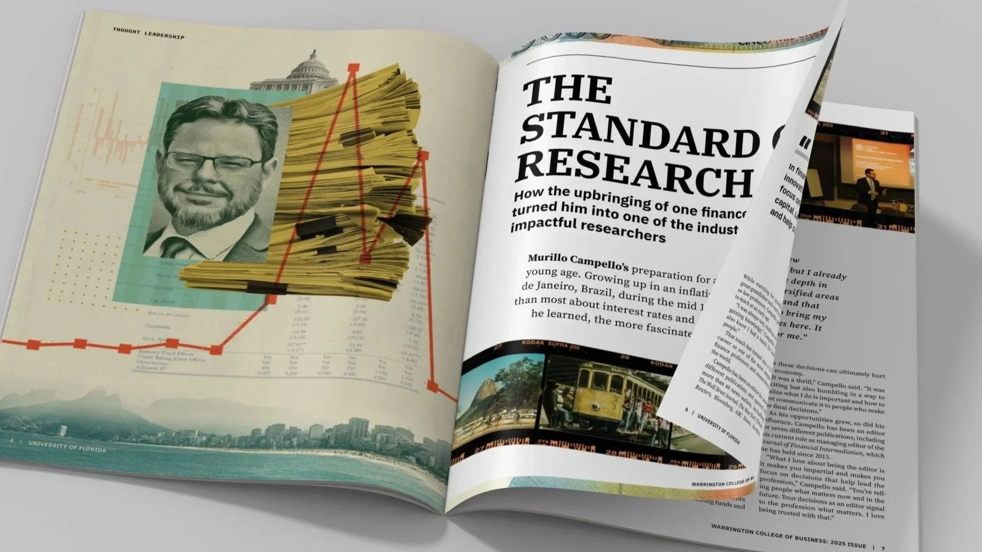
The Standard of Research combines archival photography, financial documents, and portraiture to connect a contemporary faculty profile with the subject’s academic history and global influence.
Across four annual issues, Warrington Magazine has grown from a new institutional publication into a recognizable editorial platform. The name, masthead, and visual language have evolved, while the underlying system has remained flexible enough to support different subjects, styles, and production needs.

The 2026 centennial edition demonstrates that balance: an established identity capable of supporting a distinctive anniversary treatment without losing the continuity developed over the previous three issues.